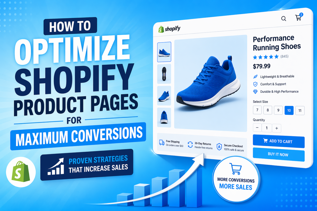
Most Shopify product pages don’t fail because of bad design—they fail because they don’t guide decisions. You can have a clean layout, decent branding, and still struggle to convert visitors into buyers. Why? Because your page isn’t doing the one thing that actually matters: reducing doubt and pushing the customer toward a clear “yes.”
There’s a common myth in eCommerce: add better images, sprinkle in some reviews, maybe tweak your CTA—and conversions will go up. That’s surface-level thinking. These tactics help, but they don’t solve the core problem. A product page isn’t just a collection of elements—it’s a decision-making environment.
This guide is different. Instead of throwing random tips at you, we’re going to break down product page optimization as a system. You’ll learn how to use psychology to remove hesitation, how to structure your page to build trust and desire, and how to make decisions based on data—not guesswork. By the end, you won’t just have ideas—you’ll understand exactly how to turn your product pages into conversion machines.
- What “Optimization” Actually Means
- The Conversion Framework
- Understanding Buyer Psychology (Why People Don’t Buy)
- Above-the-Fold Optimization (Where Conversions Start or Die)
- Product Images & Visual Selling (Not Just “High Quality”)
- Product Descriptions That Actually Sell
- Social Proof That Builds Real Trust
- Trust Signals & Risk Reversal
- Pricing & Offer Psychology (Where Money Decisions Happen)
- Mobile Optimization (Where Most Sales Happen)
- Reducing Friction (The Hidden Conversion Killer)
- Data-Driven Optimization (Real CRO, Not Guessing)
- Common Mistakes That Kill Conversions
- A Simple Optimization Checklist (Execution Layer)
- Optimization Is a System, Not a Trick
What “Optimization” Actually Means
Most people think product page optimization is about tweaking design—changing colors, adding icons, rearranging sections. That’s not optimization. That’s decoration.
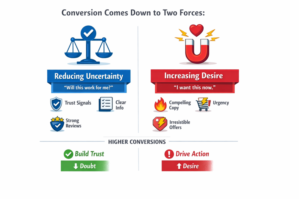
Real optimization is decision engineering.
A high-converting Shopify product page isn’t just visually appealing—it’s intentionally structured to move a visitor from uncertainty to confidence, and from hesitation to action. At its core, conversion comes down to two forces:
- Reducing uncertainty (“Will this work for me?”)
- Increasing desire (“I want this now.”)
If your page fails at either, conversions drop. It doesn’t matter how good it looks.
Here’s the shift you need to make:
Every single element on your product page is doing one of two things—
- Building trust (pushing the user closer to buying)
- Creating friction (holding them back)
Your images, copy, pricing, reviews, layout, even spacing—everything either reduces doubt or adds confusion.
That means optimization isn’t about adding more elements. In many cases, it’s about removing what doesn’t help and strengthening what actually matters.
Once you start seeing your product page through this lens, everything changes. You stop guessing. You stop copying competitors. And you start building a page that’s designed to convert—not just exist.
The Conversion Framework
Most Shopify advice throws isolated tactics at you—better images here, stronger CTA there. The problem? Tactics without structure don’t scale.
If you want consistent results, you need a system.
Here’s a simple but powerful model you can apply to any product page:
The 4-Step Conversion System
Every high-converting product page follows this flow:
Attention → Trust → Desire → Action
If any step is weak, your conversions drop. Let’s break it down.
1. Attention (Stop Scrolling)
Before anything else, you need to earn attention. If users aren’t immediately engaged, they leave—no matter how good the rest of your page is.
Purpose:
Capture interest within the first few seconds.
How it works:
- Clear, benefit-driven product title
- High-impact hero image
- Strong first impression above the fold
Example:
- Weak: “Premium Water Bottle”
- Strong: “Stay Hydrated All Day Without Refilling”
Or visually:
- A plain product image vs.
- A lifestyle image showing the product in use (gym, travel, etc.)
If you don’t stop the scroll, nothing else matters.
2. Trust (Reduce Risk)
Once you have attention, the next question in the customer’s mind is:
“Can I trust this?”
Purpose:
Eliminate doubt and perceived risk.
How it works:
- Reviews and ratings
- Testimonials or user-generated content
- Clear return policy and guarantees
Example:
- Showing “4.8⭐ from 2,300 customers”
- Adding “30-day money-back guarantee”
These elements tell the customer:
“Others bought this. It worked. You’re safe.”
No trust = no purchase. It’s that simple.
3. Desire (Increase Want)
Trust alone doesn’t sell. People need to want the product.
Purpose:
Turn interest into emotional and logical desire.
How it works:
- Benefit-driven descriptions
- Problem → solution storytelling
- Visual proof of results
Example:
- Instead of listing features like “500ml capacity”
- Show outcomes: “No more constant refilling during long workdays”
Or:
- Before/after images
- Real-life use cases
You’re not selling a product—you’re selling a better outcome.
4. Action (Make Buying Easy)
At this point, the customer is interested, trusts you, and wants the product. Now don’t lose them.
Purpose:
Remove friction and make the purchase effortless.
How it works:
- Clear, visible “Add to Cart” button
- Simple variant selection
- Fast loading and mobile-friendly design
Example:
- Sticky CTA on mobile
- One-click add to cart
The biggest mistake here? Making users think.
The Key Insight
Most Shopify stores fail because they focus on one or two of these steps—not all four.
They might:
- Have great visuals (Attention)
- But no trust signals
- Or strong desire but poor UX at checkout
A high-converting product page isn’t about isolated improvements. It’s about aligning every element to support this flow:
Guide attention → build trust → create desire → drive action
Once you understand this, optimization stops being random—and starts becoming predictable.
Understanding Buyer Psychology (Why People Don’t Buy)
Most product pages don’t fail because they look bad. They fail because they don’t address what’s happening inside the customer’s mind.
Every visitor lands on your product page with one default state: skepticism.
They’re not thinking, “Should I buy this?”
They’re thinking:
- “Is this worth it?”
- “Can I trust this?”
- “Do I really need this right now?”
If you don’t actively resolve these internal questions, they leave.
Let’s break down the four biggest psychological blockers that kill conversions.
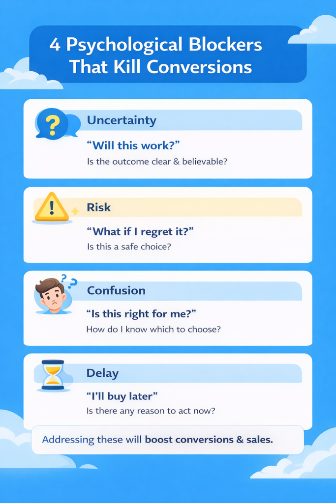
1. Uncertainty → “Will this work?”
People don’t buy when they’re unsure about the outcome.
They’re asking:
- Will this solve my problem?
- Will it work for someone like me?
- Will it perform as expected?
What causes it:
- Vague product descriptions
- Generic images
- Lack of real-world context
What fixes it:
- Clear benefit-driven copy
- Demonstrations (videos, use cases)
- Specificity (“Used by 10,000+ customers”)
The clearer the outcome, the higher the conversion.
2. Risk → “What if I regret it?”
This is one of the strongest forces in buying decisions. People hate losing more than they like gaining.
They’re thinking:
- What if this is a waste of money?
- What if it doesn’t match expectations?
- What if returning it is a hassle?
What causes it:
- No guarantees
- Unclear return policies
- Low trust in the brand
What fixes it:
- Money-back guarantees
- Easy return policies
- Trust badges and transparency
If the risk feels high, the sale won’t happen—no matter how good the product is.
3. Confusion → “Is this right for me?”
Confused people don’t buy. They leave.
They’re asking:
- Which variant should I choose?
- Is this the right product for my needs?
- What makes this different from others?
What causes it:
- Too many options
- Poorly structured information
- Lack of guidance
What fixes it:
- Simple, clear product structure
- Comparison tables or guides
- Highlighting “best for” use cases
Clarity converts. Complexity kills.
4. Delay → “I’ll buy later”
This is the silent killer of conversions.
Even if someone wants your product, they often delay the decision.
They think:
- I’ll come back later
- Let me think about it
- Maybe I’ll find a better option
And most never return.
What causes it:
- No urgency
- No compelling reason to act now
- Weak offers
What fixes it:
- Limited-time discounts
- Low stock indicators
- Time-sensitive incentives
If there’s no reason to act now, people won’t.
The Triggers That Drive Action
Now that you understand the blockers, here’s how you counter them.
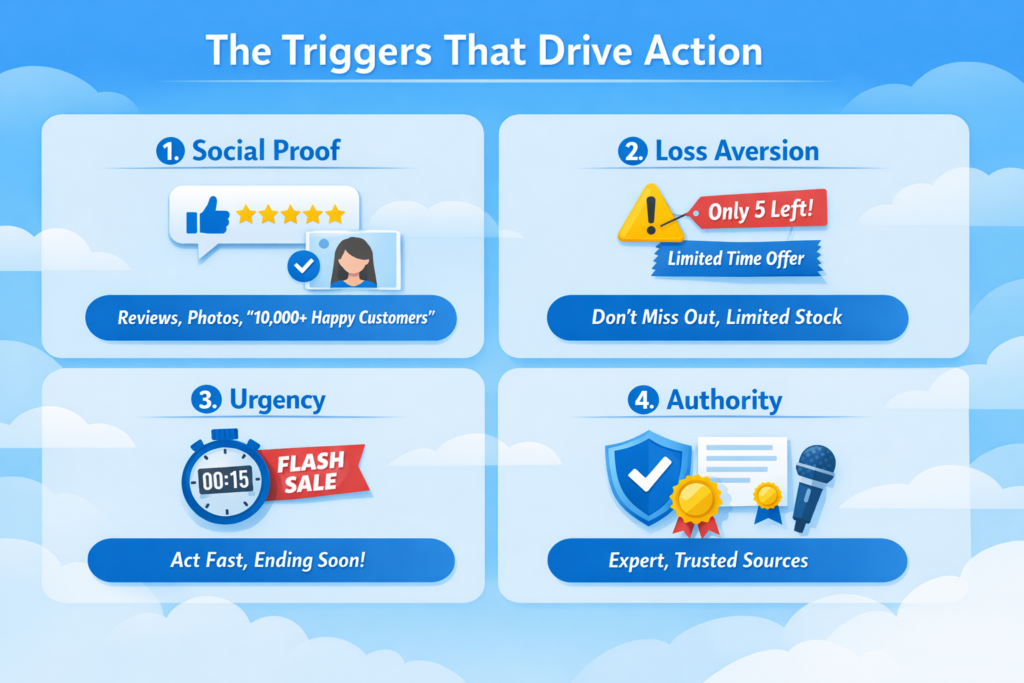
1. Social Proof
People trust other people more than brands.
Examples:
- Reviews and ratings
- Customer photos/videos
- “10,000+ happy customers”
This reduces both uncertainty and risk.
If others bought and liked it, it must be safe.
2. Loss Aversion
People are more motivated to avoid loss than to gain something new.
Examples:
- “Don’t miss out on this offer”
- “Only 5 left in stock”
- “Sale ends tonight”
Frame your offer as something they might lose—not just gain.
3. Urgency
Urgency pushes people out of delay mode.
Examples:
- Countdown timers
- Flash sales
- Limited-time bonuses
Without urgency, even interested buyers procrastinate.
4. Authority
People trust credibility signals.
Examples:
- Expert endorsements
- Media mentions
- Certifications
Authority reduces doubt instantly.
The Key Shift
Here’s the truth most people miss:
You’re not optimizing a page—you’re influencing a decision.
Design matters, but only as a vehicle. What actually drives conversions is how well your page:
- Reduces uncertainty
- Minimizes risk
- Eliminates confusion
- Forces action
Once you understand this, you stop guessing what to “add” to your page.
Instead, you start asking:
“What is stopping this person from buying—and how do I remove it?”
That’s real optimization.
Above-the-Fold Optimization (Where Conversions Start or Die)
Above the fold is the most important real estate on your product page. This is where visitors decide—within seconds—whether to stay or leave.
If this section fails, nothing below it matters.
Most Shopify stores treat this area like a design block. High-converting stores treat it like a decision trigger zone.
Let’s break down the elements that actually move conversions.
1. Product Title (Clarity > Creativity)
What Most People Do Wrong:
- Use vague or branded names
- Try to sound “cool” or clever
- Focus on the product, not the outcome
Example:
“HydroMax Elite Bottle”
This tells the user nothing.
What Actually Works:
- Clear, benefit-driven titles
- Instantly communicates what the product does
Example:
“Stay Hydrated All Day Without Refilling – Insulated Water Bottle”
Why This Works (Psychology):
When users land on your page, they’re scanning—not reading.
Your title must answer instantly:
“What is this, and why should I care?”
Clarity reduces cognitive load and uncertainty.
If people don’t understand it immediately, they bounce.
2. Images (Sell the Outcome, Not Just the Product)
What Most People Do Wrong:
- Plain product-on-white-background images
- No context of use
- No emotional connection
What Actually Works:
- Lifestyle images (product in real use)
- Before/after visuals
- Close-ups + zoom for detail
- Product videos showing results
Example:
Don’t just show a chair. Show someone working comfortably for hours.
Why This Works (Psychology):
Humans process visuals faster than text.
Good visuals:
- Reduce uncertainty (“How does this look in real life?”)
- Increase desire (“I want that experience”)
People don’t buy products—they buy outcomes.
3. Price Anchoring (Frame the Value)
What Most People Do Wrong:
- Just show a price
- No comparison
- No context
What Actually Works:
- Compare-at pricing (“$99 → $59”)
- Show savings clearly
- Bundle pricing
Why This Works (Psychology):
Price is never judged in isolation—it’s judged relative to something.
This is called anchoring.
When users see:
- $99 crossed out
- $59 current price
Their brain thinks:
“I’m getting a deal.”
Even if $59 is your intended price.
Without anchoring, your price feels higher than it is.
4. CTA Placement (Make Action Obvious)
What Most People Do Wrong:
- CTA buried below the fold
- Weak or generic buttons
- No urgency
What Actually Works:
- Prominent “Add to Cart” above the fold
- Sticky CTA (especially on mobile)
- Clear contrast (visually stands out)
Why This Works (Psychology):
When someone is ready to act, any friction kills momentum.
If they have to:
- Scroll
- Search
- Think
They hesitate.
A visible CTA reduces decision friction and captures impulse.
5. Key Benefits Bullets (Quick Decision Triggers)
What Most People Do Wrong:
- Long paragraphs
- Feature-heavy descriptions
- No scannability
What Actually Works:
- 3–5 short bullet points
- Focus on outcomes, not specs
- Easy to scan in seconds
Example:
- Keeps drinks cold for 24 hours
- Leak-proof and travel-safe
- Lightweight and easy to carry
Why This Works (Psychology):
Users don’t read—they scan.
Bullets:
- Reduce effort
- Increase clarity
- Help users quickly justify the purchase
This is where many buying decisions actually happen.
The Big Picture
Above-the-fold optimization isn’t about making things “look good.”
It’s about answering—instantly—the four critical questions in the buyer’s mind:
- What is this? (Title)
- Can I trust it? (Visuals + clarity)
- Is it worth it? (Price anchoring)
- What do I do next? (CTA)
If your above-the-fold section does this well, users stay.
If it doesn’t, they leave—no matter how good the rest of your page is.
The Brutal Truth
You don’t have 30 seconds to convince users.
You have 3–5 seconds.
That’s the window where:
- Attention is won or lost
- Interest is built or killed
- Conversion becomes possible—or impossible
Get this section right, and everything else becomes easier.
Get it wrong, and nothing else matters.
Product Images & Visual Selling (Not Just “High Quality”)
Most Shopify guides will tell you: “Use high-quality images.” That’s true—but it’s surface-level advice. High-quality alone doesn’t sell. To truly convert, images must communicate value, reduce doubt, and trigger desire.
Images are one of the fastest ways to influence the brain because humans process visuals 60,000 times faster than text. A strategically crafted visual can answer questions, demonstrate outcomes, and make decisions easier—without a single word. In other words, images reduce cognitive load, letting your visitors quickly understand what your product is, how it works, and why it matters.
1. Contextual Images (Real-Life Use)
What most stores do wrong:
- Display products on plain backgrounds with no context.
- The user struggles to imagine themselves using it.
What works:
- Show the product in real-life scenarios.
- Include people interacting with the product in ways your audience will relate to.
Example:
- Instead of showing a water bottle alone, show someone taking it to the gym or office.
- Instead of just a sofa, show a family enjoying a cozy living room.
Why it works (psychology):
- Contextual visuals answer: “How will this fit into my life?”
- They reduce uncertainty and make the outcome tangible.
2. Before/After Visuals
What most stores do wrong:
- Only show the product itself, ignoring the transformation it creates.
What works:
- Show clear “before and after” scenarios to demonstrate the product’s impact.
Example:
- A skincare product: one photo before use, one after a few weeks.
- A cleaning tool: messy room → spotless room.
Why it works:
- Before/after taps into emotional desire, showing exactly what users can achieve.
- It turns abstract benefits into concrete outcomes.
3. Zoom & Detail Shots
What most stores do wrong:
- Rely solely on hero images. Users can’t inspect materials, texture, or features.
What works:
- Provide multiple angles, close-ups, and zoom options.
- Highlight details that matter—stitching, material quality, buttons, or texture.
Why it works:
- Reduces perceived risk because users feel they’ve “examined” the product.
- Makes online buying feel closer to in-person shopping.
4. Video Demonstrations
What most stores do wrong:
- Use videos for aesthetics only, like rotating product shots.
- Forget to show practical use.
What works:
- Short, focused videos that show how to use the product or the outcome it delivers.
- Example: “See how this blender crushes ice in 10 seconds.”
Why it works:
- Videos engage multiple senses simultaneously—sight, sound, and motion.
- Demonstrations answer questions instantly, reducing decision friction.
- Creates trust: seeing a product in action makes it tangible and credible.
5. Strategic Takeaways
- Don’t just aim for “pretty.”
- Each image should serve a purpose: reduce doubt, trigger desire, or guide action.
- Combine: contextual + before/after + zoom + video → a visual story that converts.
In short, product visuals are not decoration—they are a conversion engine. They communicate value faster than any copy, reduce uncertainty, and make the buying decision effortless. The better you plan your images strategically, the less cognitive effort your visitors have to expend—and the higher your conversion rates climb.
Product Descriptions That Actually Sell
Most Shopify stores treat product descriptions as an afterthought—a block of text that explains features. That approach doesn’t sell. A product description is your primary opportunity to convert interest into desire, and every word matters.
The key is to write descriptions that guide the reader through a decision-making journey, not just list specs. Here’s the structure that consistently works.
1. Hook (The First 2 Lines Matter Most)
What most stores do wrong:
- Start with generic product statements.
- Lead with features rather than outcomes.
What works:
- Grab attention immediately by addressing the main benefit or pain point.
Example:
- Bad: “Our insulated water bottle holds 500ml of liquid.”
- Good: “Stay hydrated all day without constant refills—your new go-to bottle for work, gym, and travel.”
Why it works:
- The first two lines determine whether someone keeps reading.
- Strong hooks reduce cognitive effort and make the page immediately relevant.
2. Problem → Solution Framing
What most stores do wrong:
- Focus on product specs without connecting to the customer’s needs.
What works:
- Highlight the problem your customer faces, then position the product as the solution.
Example:
- Bad: “Made from stainless steel with double-wall insulation.”
- Good: “Tired of lukewarm drinks halfway through the day? This insulated bottle keeps beverages cold for 24 hours and hot for 12.”
Why it works:
- Customers buy solutions, not products.
- Framing it this way reduces uncertainty: they can visualize how the product improves their life.
3. Benefits > Features
What most stores do wrong:
- Focus on listing features without explaining the benefit.
What works:
- Always lead with the benefit, then mention features as supporting proof.
Example:
- Bad: “Comes with a leak-proof cap and ergonomic handle.”
- Good: “Carry it anywhere without spills, thanks to a leak-proof cap and a comfortable ergonomic handle.”
Why it works:
- People care about what the product does for them, not technical details.
- Benefits trigger desire; features reinforce credibility.
4. Objection Handling
What most stores do wrong:
- Leave potential doubts unaddressed.
- Assume the visitor will figure it out themselves.
What works:
- Anticipate objections and answer them proactively.
- Address common concerns: quality, durability, ease of use, compatibility, or returns.
Example:
- Bad: No mention of durability or return policy.
- Good: “Built to last with premium materials, and if you’re not satisfied, enjoy our 30-day money-back guarantee.”
Why it works:
- Eliminates hesitation and reduces perceived risk.
- Makes the purchase feel safe and easy.
Putting It All Together
Here’s a full transformation example:
Bad Description:
“This stainless steel water bottle holds 500ml. Comes with a leak-proof cap and ergonomic handle. Available in blue, red, and black.”
Good Description:
“Stay hydrated all day without constant refills—your perfect companion for work, gym, and travel. Tired of lukewarm drinks? This insulated bottle keeps beverages cold for 24 hours and hot for 12. Carry it anywhere without spills, thanks to a leak-proof cap and ergonomic handle. Available in three vibrant colors to match your style. Built to last with premium materials, and backed by our 30-day money-back guarantee.”
Notice the difference: the good description hooks, frames a problem, highlights benefits, and addresses objections, all in one flow.
Key Takeaways
- Lead with a strong hook—grab attention immediately.
- Frame the product as the solution to a real problem.
- Focus on benefits first, features second.
- Anticipate objections and handle them proactively.
- Write for scanning and comprehension—keep sentences clear and concise.
Done right, your product description becomes a mini sales pitch, guiding visitors effortlessly from interest to action.
Social Proof That Builds Real Trust
Adding a few generic reviews isn’t enough. Most Shopify stores think social proof is a checkbox: “Add stars, maybe a testimonial, done.” That approach does little to actually build confidence. Real social proof reduces uncertainty and accelerates buying decisions, but only if it’s relevant, authentic, and strategically presented.
Let’s break down the types that matter—and how to use them effectively.
1. Reviews
What most stores do wrong:
- Few reviews or only generic praise.
- Focus on star ratings instead of meaningful content.
What works:
- Display reviews that highlight specific benefits or real-world experiences.
- Include both short summaries and detailed reviews for depth.
- Show variety: new customers, repeat buyers, and different use cases.
Why it works:
- Customers relate more to stories than numbers.
- Authentic, detailed reviews reduce uncertainty because buyers see what to expect.
2. User-Generated Content (UGC)
What most stores do wrong:
- Only stock photos or staged images.
- Ignore customer photos or videos.
What works:
- Encourage buyers to share photos or videos using the product.
- Feature them on your product page or gallery.
Example:
- A skincare brand shows customers’ before/after photos using the product.
- A fitness product includes short video clips of users in action.
Why it works:
- UGC signals real-world usage.
- It builds credibility and relatability—customers trust other users more than brands.
3. Testimonials
What most stores do wrong:
- Generic quotes without context.
- Testimonials from anonymous sources or unclear authority.
What works:
- Include names, photos, and short stories of satisfied customers.
- Highlight measurable results if possible.
Example:
“I was skeptical at first, but after using this insulated bottle every day for a month, my drinks stay cold all day. I take it everywhere!” – Sarah L., NYC
Why it works:
- Testimonials humanize your brand.
- They reduce risk perception and make benefits tangible.
4. Influencer Validation
What most stores do wrong:
- Random influencer endorsements without fit to your audience.
- Generic “so-and-so recommends” lines with no proof.
What works:
- Partner with influencers whose audience matches your ideal customer.
- Include visuals or videos showing the influencer using the product.
- Be transparent about partnerships to maintain authenticity.
Why it works:
- Authority from someone the customer respects strengthens trust.
- Social validation from a credible source speeds up decision-making.
Key Insight: Quantity ≠ Trust
Many stores believe the more reviews, the better. But volume alone doesn’t build trust. One highly relevant, authentic testimonial can be more persuasive than hundreds of generic 5-star reviews.
Relevance + authenticity = trust.
- Relevance: Make sure the proof reflects the user’s context and pain points.
- Authenticity: Use real stories, real photos, and verifiable results.
Strategic Takeaway
- Don’t just “add reviews.” Craft a social proof ecosystem: reviews, UGC, testimonials, and influencer validation.
- Prioritize relevant, authentic, and relatable content over sheer numbers.
- Display social proof where it reduces doubt and increases confidence—above the fold, near CTAs, and in sections where users hesitate.
Done right, social proof becomes a decision accelerator, transforming hesitant visitors into confident buyers.
Trust Signals & Risk Reversal
Even if your product looks amazing, your page is persuasive, and social proof is solid, some visitors still hesitate. Why? Fear of loss. People don’t buy because they’re afraid of wasting money, receiving a poor product, or dealing with a complicated return process. That’s where trust signals and risk reversal come in—they remove fear and make the purchase feel safe.
1. Guarantees
What most stores do wrong:
- No guarantees, or vague statements like “Satisfaction guaranteed.”
What works:
- Specific, clear guarantees that reduce perceived risk.
- Examples: “30-day money-back guarantee,” “Lifetime warranty,” or “Try it risk-free for 14 days.”
Why it works:
- Guarantees shift the perceived risk from the buyer to the seller.
- When customers feel they have nothing to lose, they are far more likely to purchase.
2. Return Policies
What most stores do wrong:
- Hidden or complicated returns.
- Ambiguous terms that confuse buyers.
What works:
- Simple, transparent return policies with step-by-step instructions.
- Highlight them near the CTA or product details.
Example:
“Easy returns within 30 days. No questions asked. Free shipping on returns.”
Why it works:
- A clear return policy signals honesty and accountability, reducing anxiety.
3. Shipping Clarity
What most stores do wrong:
- Vague shipping timelines (“Ships in 3–5 days”).
- No mention of costs upfront.
What works:
- Show exact delivery times, costs, and tracking options.
- Offer free or fast shipping whenever possible.
Why it works:
- Shipping uncertainty is a major abandonment driver.
- Clear expectations reduce hesitation at checkout.
4. Payment Security
What most stores do wrong:
- Only standard checkout with no trust indicators.
- Visitors worry about fraud or stolen card details.
What works:
- Display recognizable payment badges (Visa, Mastercard, PayPal, Apple Pay).
- Use SSL certificates and highlight secure checkout messages.
Why it works:
- Trust in payment security directly reduces perceived financial risk.
- Makes buyers comfortable completing transactions online.
Core Takeaway
Optimizing your product page isn’t just about desire—it’s about removing fear.
Guarantees, return policies, shipping clarity, and payment security don’t just inform—they reassure. Each one signals to visitors:
“Buying from us is safe. You won’t lose money, time, or peace of mind.”
When fear is removed, hesitation disappears, and conversions climb.
Pricing & Offer Psychology (Where Money Decisions Happen)
Price isn’t just a number—it’s a psychological signal that shapes how your customers perceive value and make decisions. Most Shopify stores make the mistake of assuming the lowest price equals higher conversions. That’s dead wrong. In reality, cheap often reduces perceived value, while smart pricing strategies can increase both conversions and average order value.
Let’s break down the key tactics that turn pricing into a strategic conversion lever.
1. Anchoring (Compare-at Pricing)
What most stores do wrong:
- Show a single price with no context.
What works:
- Display a higher “compare-at” price next to the actual price.
- Example: “Was $99 → Now $59”
Why it works:
- Anchoring makes the current price feel like a deal.
- The brain evaluates value relatively, not absolutely.
- Customers feel they’re getting a gain, which triggers loss aversion—they don’t want to miss out.
2. Bundles
What most stores do wrong:
- Offer only single products.
- Ignore cross-sell opportunities.
What works:
- Package related products at a slightly discounted price.
- Example: Buy the water bottle + carrying sleeve for $79 instead of $99.
Why it works:
- Bundles increase perceived value and average order value.
- People rationalize spending more when it feels like a deal and solves multiple needs.
3. Discounts vs. Perceived Value
What most stores do wrong:
- Rely heavily on permanent discounts.
- Undermine brand value by making products feel cheap.
What works:
- Use limited-time discounts or promotional codes strategically.
- Ensure original price signals quality, then offer a discount to create urgency.
Why it works:
- Temporary discounts tap into urgency and loss aversion.
- Maintaining a reasonable original price preserves perceived quality, which is critical for higher-ticket products.
4. Free Shipping Psychology
What most stores do wrong:
- Hide shipping costs until checkout.
- Offer low shipping fees instead of free shipping.
What works:
- Offer free shipping above a minimum order threshold.
- Highlight it clearly near the CTA.
Why it works:
- Unexpected costs are the #1 cart abandonment reason.
- Free shipping is perceived as a bonus, even if the cost is built into the product.
- Thresholds encourage customers to add more items to qualify.
5. Why Cheap ≠ High Converting
- Low prices can signal low quality, causing hesitation.
- Customers often equate value with price; too cheap can trigger doubt.
- Smart pricing balances perceived value, affordability, and urgency—not just the lowest number.
Strategic Takeaways
- Anchor your prices to make deals obvious.
- Bundle products to increase AOV and perceived value.
- Use discounts strategically, not permanently, to preserve brand perception.
- Offer free shipping as a conversion booster, not a cost burden.
- Avoid cheapening your brand—perceived value drives conversion more than low cost.
Price decisions happen in the buyer’s mind long before the checkout page. When your pricing communicates value, fairness, and urgency, money becomes a motivator rather than a barrier.
Mobile Optimization (Where Most Sales Happen)
Over 70% of Shopify traffic comes from mobile devices, and yet most stores treat mobile like a smaller desktop version. That’s a huge mistake—mobile shopping isn’t just smaller screens, it’s a completely different user behavior. Optimizing for mobile can dramatically improve conversions if done right.
1. Thumb-Friendly Design
What most stores do wrong:
- Tiny buttons or links hard to tap.
- Elements too close together, causing accidental clicks.
What works:
- Use large, easily tappable buttons.
- Leave enough spacing between interactive elements.
- Keep primary CTAs within the thumb zone (center and lower half of the screen).
Why it works:
- Mobile users navigate mostly with thumbs.
- Making interaction effortless reduces friction and prevents frustration-driven bounces.
2. Sticky CTA
What most stores do wrong:
- Place “Add to Cart” only at the bottom of long pages.
- Users have to scroll up or down to act.
What works:
- Implement a sticky CTA button that stays visible as the user scrolls.
- Make it visually distinct and always one tap away.
Why it works:
- Reduces cognitive load and friction.
- Captures impulse decisions—especially for high-intent shoppers.
3. Scroll Behavior & Content Flow
What most stores do wrong:
- Dump content in blocks without hierarchy.
- Important elements buried too deep.
What works:
- Prioritize above-the-fold clarity.
- Keep key visuals, benefit bullets, and CTA early.
- Use progressive disclosure: details expand as the user scrolls.
Why it works:
- Mobile users scan, swipe, and scroll quickly.
- Structuring content for fast scanning keeps attention and reduces drop-offs.
4. Speed & Performance
What most stores do wrong:
- Heavy images, unoptimized scripts, slow-loading pages.
- Visitors abandon if load time > 3 seconds.
What works:
- Compress images without losing quality.
- Minimize unnecessary scripts and apps.
- Use fast, mobile-optimized themes.
Why it works:
- Every extra second of load time increases bounce risk.
- Fast pages keep users engaged, making it easier to convert.
Key Takeaway
Mobile isn’t just “shrunk desktop design.” Think thumb-friendly, frictionless, fast, and scannable. Sticky CTAs, well-prioritized content, and optimized speed turn casual scrolls into confident clicks.
Reducing Friction (The Hidden Conversion Killer)
Most store owners focus on adding things—more features, more sections, more information. But high-converting product pages often win by doing the opposite: removing friction.
Friction is anything that slows the user down, confuses them, or makes the decision harder. And here’s the core truth:
Every extra step, thought, or second reduces your conversion rate.
Let’s break down the biggest friction points killing your sales.
1. Too Many Choices
What most stores do wrong:
- Offer too many variants (colors, sizes, bundles) without guidance
- Present all options equally without prioritization
What works:
- Limit choices or guide users toward a default option
- Highlight “Most Popular” or “Best Value” selections
Why it works (psychology):
Too many options create decision fatigue. Instead of choosing, users delay or leave.
The easier the decision, the higher the conversion.
2. Cluttered Layout
What most stores do wrong:
- Overload pages with badges, popups, banners, and text
- Try to show everything at once
What works:
- Clean, structured layout with clear hierarchy
- Focus only on elements that support the buying decision
Why it works:
Clutter increases cognitive load—users have to think harder to process information.
When the page feels overwhelming, people exit instead of deciding.
3. Confusing Variants
What most stores do wrong:
- Poorly labeled options (e.g., “Option 1,” “Option 2”)
- No explanation of differences
- No visual support for choices
What works:
- Clear labels (e.g., “Small – Best for travel”)
- Visual selectors (color swatches, images)
- Guidance like “Recommended for beginners”
Why it works:
Clarity removes hesitation. If users don’t understand what to pick, they won’t pick anything.
Confusion kills conversions instantly.
4. Slow Load Time
What most stores do wrong:
- Heavy images, too many apps, bloated scripts
- Ignoring performance completely
What works:
- Optimize images and reduce unnecessary elements
- Use fast-loading themes and minimal scripts
Why it works:
Speed directly impacts behavior. Even a 1–2 second delay can increase bounce rates significantly.
Slow pages break momentum before the decision even begins.
The Real Insight
Most people think conversions are about persuasion. That’s only half the truth.
The other half is this:
Conversion is about removing resistance.
You don’t always need to convince people more—you need to make it easier for them to say yes.
Strategic Takeaways
- Reduce choices or guide decisions clearly
- Remove unnecessary clutter—focus only on what matters
- Simplify variants and make selection intuitive
- Optimize speed to maintain momentum
Every improvement here compounds. Small friction points add up—and so do small optimizations.
When your page feels effortless to use, decisions happen faster. And when decisions happen faster, conversions go up.
Data-Driven Optimization (Real CRO, Not Guessing)
Most Shopify store owners optimize based on opinions:
- “I think this color will convert better”
- “This layout looks cleaner”
- “Let’s add more reviews”
That’s not optimization. That’s guessing.
Real conversion rate optimization (CRO) is data-driven. You don’t rely on what you think works—you rely on what users actually do.
Don’t optimize based on opinions—optimize based on data.
Here’s how to do it properly.
1. A/B Testing (What Actually Works vs. What You Think Works)
What it is:
A/B testing means comparing two versions of a page or element to see which performs better.
Example:
- Version A: “Add to Cart” button (green)
- Version B: “Buy Now” button (black)
You split traffic between both and measure which one converts more.
What most stores do wrong:
- Change multiple things at once
- Don’t track results properly
- Stop tests too early
What works:
- Test one variable at a time (CTA, headline, price, image)
- Run tests long enough for meaningful data
- Focus on high-impact areas (above the fold, CTA, pricing)
Why it works:
A/B testing removes bias. It tells you what users actually prefer—not what you assume.
2. Heatmaps (Where Users Focus)
What it is:
Heatmaps visually show where users click, scroll, and spend time on your page.
What you’ll discover:
- Which sections get attention
- Which elements are ignored
- Where users drop off
Example insights:
- Users never scroll to your product description → it’s too far down
- No one clicks your CTA → it’s not visible enough
Why it matters:
Heatmaps reveal attention gaps—places where your page is failing silently.
3. Session Recordings (How Users Actually Behave)
What it is:
Session recordings let you watch real users interacting with your site.
What most stores miss:
Analytics show numbers—but not behavior. Session recordings show:
- Where users hesitate
- Where they get confused
- Where they abandon
Example insights:
- Users repeatedly clicking non-clickable elements
- Struggling to select product variants
- Scrolling up and down (indicates confusion)
Why it works:
You see friction in real time. Not assumptions—actual behavior.
The Metrics That Actually Matter
You don’t need 50 metrics. Focus on the ones that directly impact revenue.
1. Conversion Rate
What it tells you:
Percentage of visitors who complete a purchase
The ultimate measure of effectiveness
2. Add-to-Cart Rate
What it tells you:
How many users show buying intent
If this is low → your product page isn’t convincing
3. Bounce Rate
What it tells you:
How many users leave without interacting
If this is high → your above-the-fold is failing
The Real Insight
Most people try to “fix” their product pages blindly.
They:
- Copy competitors
- Follow random advice
- Keep redesigning
But without data, you’re just guessing in a loop.
Strategic Takeaways
- Use A/B testing to validate decisions
- Use heatmaps to understand attention
- Use session recordings to uncover friction
- Track key metrics to measure impact
The Bottom Line
Optimization is not a one-time task—it’s a continuous process.
You test → learn → improve → repeat.
And over time, small improvements compound into massive gains.
When you shift from opinions to data, your product page stops being a guess—and starts becoming a predictable conversion system.
Common Mistakes That Kill Conversions
Most Shopify product pages don’t fail because of one big mistake—they fail because of multiple small ones stacking up. Fix these, and you’ll often see immediate improvements.
1. Weak Product Positioning
The mistake:
Your product looks like every other option in the market. No clear reason to choose you.
What it looks like:
- Generic titles and descriptions
- No clear target audience
- No differentiation from competitors
Why it kills conversions:
If users can’t answer “Why this product?”, they won’t buy.
Fix:
- Clearly communicate who it’s for
- Highlight unique value (quality, design, results, price, etc.)
- Make your positioning obvious within seconds
2. Overloading the Page
The mistake:
Trying to include everything—badges, popups, long text, too many sections.
What it looks like:
- Cluttered layout
- Too many competing elements
- No clear focus
Why it kills conversions:
Overload increases cognitive fatigue. When users feel overwhelmed, they leave instead of deciding.
Fix:
- Keep only what supports the buying decision
- Prioritize clarity over quantity
- Create a clean visual hierarchy
3. Generic Copy
The mistake:
Using boring, non-specific language that doesn’t connect.
What it looks like:
- “High quality product”
- “Best in the market”
- Feature-heavy descriptions with no benefits
Why it kills conversions:
Generic copy doesn’t build trust or desire. It feels like marketing—not reality.
Fix:
- Be specific and outcome-focused
- Show real benefits and use cases
- Write like you’re talking to one person, not everyone
4. Ignoring Mobile
The mistake:
Designing for desktop and treating mobile as an afterthought.
What it looks like:
- Hard-to-click buttons
- Poor layout on small screens
- Slow loading
Why it kills conversions:
Most users are on mobile. A bad mobile experience = lost sales.
Fix:
- Optimize for thumb-friendly navigation
- Use sticky CTAs
- Prioritize speed and simplicity
The Bottom Line
These mistakes aren’t complicated—but they’re costly.
- Weak positioning makes you forgettable
- Clutter makes you confusing
- Generic copy makes you unconvincing
- Poor mobile experience makes you unusable
Fix these, and you’re already ahead of most Shopify stores.
A Simple Optimization Checklist (Execution Layer)
At this point, you understand the strategy. Now let’s simplify it into something you can actually execute.
Use this checklist to audit your Shopify product pages. If you can confidently check most of these, you’re already ahead of the majority of stores.
Above-the-Fold Clarity
- Product title clearly explains what it is and the main benefit
- Hero image shows the product in real-life use (not just plain background)
- Price is clearly visible with anchoring (if applicable)
- Key benefits are summarized in 3–5 bullet points
- CTA (“Add to Cart”) is visible without scrolling
Strong Visuals
- Multiple high-quality images (different angles + context)
- Lifestyle images that show outcomes, not just the product
- Zoom or close-up shots for details
- At least one product video demonstrating use or results
Trust Elements
- Reviews with real, specific feedback (not generic)
- User-generated content (photos/videos from customers)
- Clear return policy and money-back guarantee
- Trust badges or secure payment indicators
Fast Loading & Performance
- Images are optimized (no unnecessary large files)
- Page loads quickly on both mobile and desktop
- Minimal use of heavy apps or scripts
- Smooth scrolling and no lag
Clear & Frictionless CTA
- CTA button is prominent and easy to tap (especially on mobile)
- Sticky CTA is implemented for long pages
- Variant selection is simple and clearly labeled
- No unnecessary steps before adding to cart
How to Use This
Don’t try to fix everything at once.
Go through this checklist and:
- Identify the weakest areas
- Fix high-impact issues first (above the fold, CTA, visuals)
- Test changes and measure results
The Reality
Most product pages don’t fail because they lack effort—they fail because they lack clarity and focus.
This checklist forces you to focus on what actually matters:
- Clear communication
- Strong trust
- Low friction
Execute this properly, and your product page won’t just look better—it will convert better.
Optimization Is a System, Not a Trick
Most people approach Shopify optimization like a checklist—add reviews, improve images, tweak the CTA. But as you’ve seen, that’s not what actually drives conversions.
It’s not about adding more elements.
It’s about guiding decisions.
A high-converting product page works because every part of it is aligned:
- It grabs attention
- Builds trust
- Creates desire
- Removes friction
- Makes action effortless
When these pieces work together, conversions stop feeling random. They become predictable.
The biggest mistake you can make now is doing nothing—or trying to fix everything at once.
Instead:
- Start with your above-the-fold section
- Fix the biggest friction points
- Improve clarity, trust, and flow
- Then test and refine based on data
Optimization isn’t a one-time fix. It’s a continuous process of understanding your customers better and removing what’s stopping them from buying.
Do this right, and your product page won’t just look good—it will consistently turn visitors into customers.
FAQ
What is a good Shopify conversion rate?
A “good” Shopify conversion rate typically falls between 2% to 4%, depending on your niche, traffic quality, and pricing.
- Below 2% → Your page likely has major issues (trust, clarity, or friction)
- 2%–4% → Average performance
- 5%+ → Strong, well-optimized store
But here’s the real insight:
Don’t obsess over industry averages. Focus on improving your own baseline.
If you move from 1.5% to 3%, you’ve doubled your revenue—without increasing traffic. That’s the power of optimization.
How do I increase product page conversions?
There’s no single “hack.” Conversions improve when you fix the core system:
- Improve above-the-fold clarity (title, images, CTA)
- Add strong social proof and trust signals
- Reduce friction (simplify layout, variants, and flow)
- Use better product descriptions (benefits, not features)
- Optimize for mobile and speed
- Test changes using data (A/B testing, heatmaps)
The key is prioritization. Start with high-impact areas like visuals, trust, and CTA before tweaking smaller details.
Do product videos help conversion?
Yes—significantly, if used correctly.
Product videos work because they:
- Show the product in action
- Reduce uncertainty (“How does this actually work?”)
- Increase engagement and time on page
But here’s the catch:
Most stores use videos wrong.
What works:
- Demonstration videos (how it works, real use cases)
- Short, focused clips (15–45 seconds)
- Showing outcomes, not just aesthetics
What doesn’t work:
- Slow, cinematic videos with no clear value
- Overly long or irrelevant content
A good product video can replace paragraphs of explanation and make decisions faster.
How important are reviews?
Reviews are one of the most powerful conversion drivers—but only if they’re done right.
Why they matter:
- Reduce uncertainty
- Build trust through real experiences
- Validate the product’s claims
But not all reviews are equal.
High-impact reviews:
- Specific and detailed (“Used this for 2 weeks, keeps drinks cold all day”)
- Include photos or videos
- Reflect different types of customers
Low-impact reviews:
- Generic (“Great product!”)
- No context or proof
Also, don’t aim for perfection. A mix of slightly imperfect reviews can actually increase credibility.
Final Insight
These questions all point to one thing:
Conversions don’t increase because of one tactic—they increase when your entire page works together.
Focus on clarity, trust, desire, and friction. Then validate everything with data.
That’s how you turn traffic into revenue.