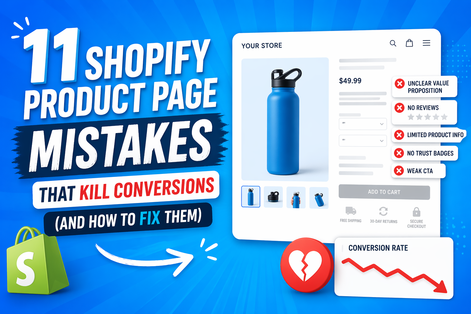
Shopify stores don’t fail because they lack traffic—they fail because their product pages don’t convert. You can spend thousands on ads, bring in thousands of visitors, and still struggle to make consistent sales if your product page is weak.
The harsh reality is that traffic is not the problem in most cases. Even well-designed stores with solid products lose money every day because of small issues like unclear messaging, weak trust signals, and poor user experience. These problems don’t look serious individually, but together they quietly destroy conversion rates.
Most store owners make the same mistake: they blame marketing, ads, or pricing when sales don’t come in. In reality, the real leak is happening after the click—on the product page itself.
In this article, you’ll learn the 11 most critical Shopify product page mistakes that are killing conversions, why each one directly impacts your sales, and how to fix them step by step. The goal is not theory—it’s practical improvements you can apply immediately.
This article breaks down the exact mistakes silently killing your Shopify sales—and how to fix each one.
Table of Contents
- Why Shopify Product Pages Fail
- Mistake #1–3: Clarity Breakdowns (Top Conversion Killers)
- Mistake #4–6: Trust Failures (Conversion Deal Breakers)
- Mistake #7–9: Visual & UX Failures
- Mistake #10–11: Conversion Friction Killers
- The Fix: High-Converting Product Page Framework
- Quick Optimization Checklist (Action Section)
- Conclusion
- FAQ: Shopify Product Page Optimization
Why Shopify Product Pages Fail
Most Shopify product pages don’t fail because of one big issue—they fail because of three fundamental breakdowns happening at the same time. When you zoom out, almost every conversion problem falls into one of these categories: clarity, trust, or friction.
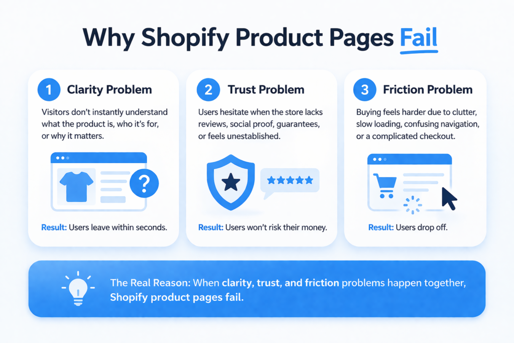
A. Clarity Problem
The first and most common issue is clarity. Visitors land on a product page and don’t instantly understand what the product is, who it’s for, or why it matters. If the value proposition isn’t immediately obvious, users don’t explore further—they leave. In ecommerce, attention spans are extremely short, and confusion is enough to kill interest within seconds.
B. Trust Problem
Even if the product is clear, users still hesitate if they don’t trust the store. This includes missing or weak reviews, lack of social proof, no guarantees, or a brand that feels unestablished. Online buyers are naturally skeptical, especially with new or unfamiliar stores. If trust isn’t built quickly, users won’t risk their money.
C. Friction Problem
The final barrier is friction. This happens when users want the product but the experience slows them down. It could be a cluttered layout, confusing navigation, slow loading speed, or a complicated checkout flow. Even small friction points reduce buying momentum and increase drop-offs.
When you combine these three issues—lack of clarity, lack of trust, and unnecessary friction—you get the real reason Shopify product pages fail. And most store owners don’t realize they are struggling with all three at once.
Mistake #1–3: Clarity Breakdowns (Top Conversion Killers)
Clarity is the first and most important layer of a high-converting Shopify product page. If users don’t instantly understand what you’re selling and why it matters, nothing else on the page will save the sale. These three mistakes alone are responsible for a large percentage of abandoned product pages.
Mistake #1: Weak Product Title / Value Proposition
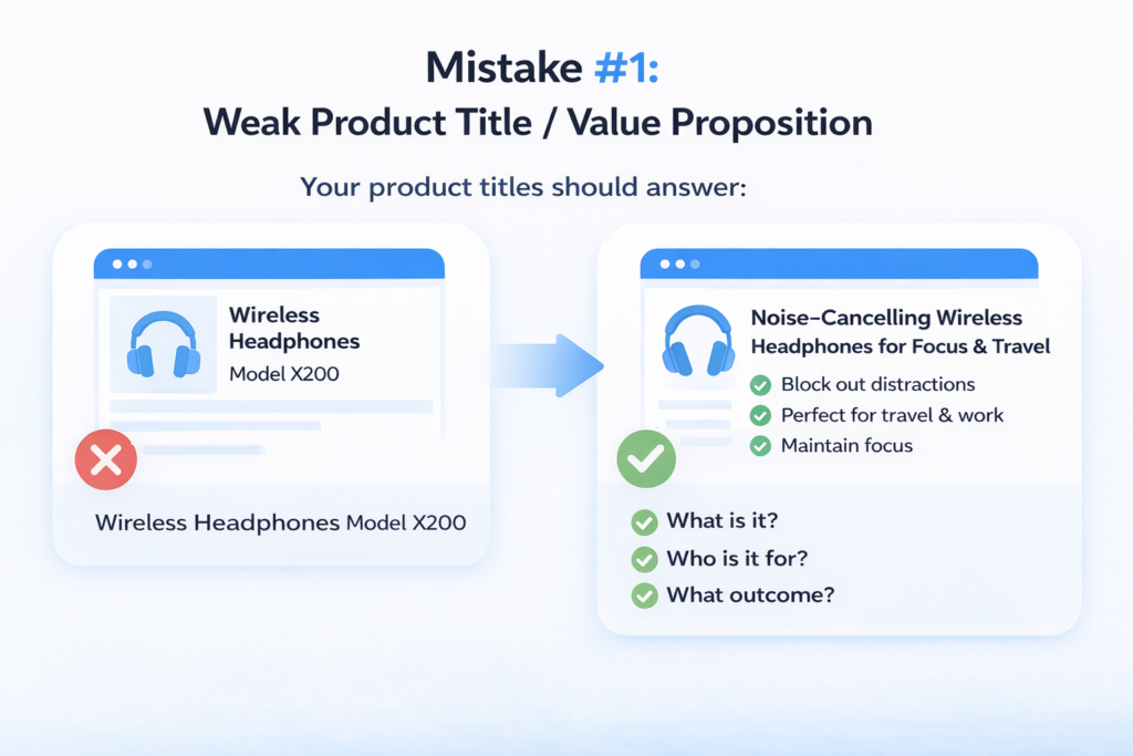
One of the most overlooked conversion killers is a weak or generic product title. Many store owners treat the product title as a label instead of a sales tool. But in reality, the title is the first message users see—and it heavily influences whether they stay or leave.
Users don’t spend time analyzing product pages. In the first 2–3 seconds, they are scanning for one thing: “Is this relevant to me?” If your title is vague, overly technical, or generic, the answer becomes unclear—and unclear pages don’t convert.
Compare this:
- ❌ “Wireless Headphones Model X200”
- ✅ “Noise-Cancelling Wireless Headphones for Focus & Travel”
The first tells nothing meaningful. The second immediately communicates benefit, use case, and audience. That difference alone changes user intent.
A strong title should answer:
- What is it?
- Who is it for?
- What outcome does it deliver?
If your product title doesn’t do that instantly, you’re losing attention before the user even scrolls.
Mistake #2: No Clear Product Positioning
Even when the product name is clear, many Shopify stores fail at positioning. This creates a deeper problem: users don’t know whether the product is meant for them.
This leads to the silent killer question running in the user’s mind: “Is this actually for me?”
If the answer isn’t obvious, hesitation begins—and hesitation kills conversions.
A common issue is trying to appeal to everyone. Stores describe products in a broad, generic way that doesn’t define a clear target audience. The result is confusion instead of connection.
Strong product positioning solves this by being specific:
“This product is designed for busy professionals who want better focus during work hours.”
Or:
“Built for travelers who need lightweight, long-lasting comfort on the go.”
This level of clarity removes uncertainty. It helps users self-identify immediately and increases emotional relevance.
If your product doesn’t clearly define who it is for, it effectively becomes irrelevant to everyone.
Mistake #3: Poor Product Description Structure
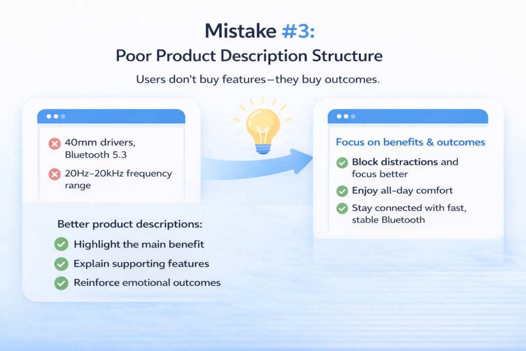
The third major clarity issue is how product descriptions are written. Most Shopify stores either over-explain technical details or dump a list of features without context. Both approaches fail because they don’t communicate value.
Users don’t buy features—they buy outcomes.
For example:
- ❌ “Includes 40mm drivers, Bluetooth 5.3, 20Hz–20kHz frequency range”
- ❌ “High-quality premium materials used”
These statements may be accurate, but they don’t answer the user’s real question: “What will this do for me?”
A better approach is benefit-led structure:
- “Block distractions so you can focus anywhere”
- “Enjoy all-day comfort without ear fatigue”
- “Stay connected with stable, fast Bluetooth performance”
This shifts the focus from specifications to real-world impact.
A strong product description should:
- Start with the main benefit
- Support it with features
- Reinforce the emotional outcome
When done correctly, users don’t just understand the product—they feel its value.
Key Insight
Clarity decides whether users stay or leave within seconds.
Mistake #4–6: Trust Failures (Conversion Deal Breakers)
If clarity gets users to understand your product, trust is what gets them to buy it. This is where most Shopify stores silently lose the majority of their potential customers. Even when the product is clear and relevant, users will not purchase unless they feel safe.
Trust is not one element—it is a combination of social proof, risk reduction, and credibility signals. When any of these are missing, hesitation increases, and conversions drop sharply.
Mistake #4: No or Weak Social Proof
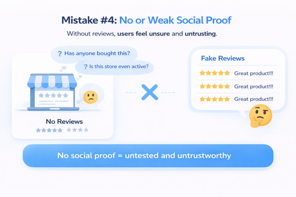
Social proof is one of the strongest psychological drivers in ecommerce. People don’t just want to know that a product is good—they want to know that other people have already bought it and had a positive experience.
Yet many Shopify stores either:
- Don’t have reviews at all
- Have very few reviews
- Or use low-quality, fake-looking reviews that feel unnatural
All three scenarios damage conversions.
The absence of reviews creates uncertainty. Users start questioning:
- “Has anyone actually bought this?”
- “Is this store even active?”
- “Am I the first customer?”
And when reviews do exist but look fake or overly generic (“Great product!!!”), they often backfire. Modern buyers are extremely sensitive to authenticity. They can instantly recognize fake patterns, and instead of building trust, it creates doubt.
Strong social proof should feel real, specific, and relatable. Detailed reviews that mention usage context, results, or emotional outcomes perform far better than generic praise.
Without social proof, your product feels untested. And untested products rarely convert.
Mistake #5: No Risk Reversal (Guarantee Missing)
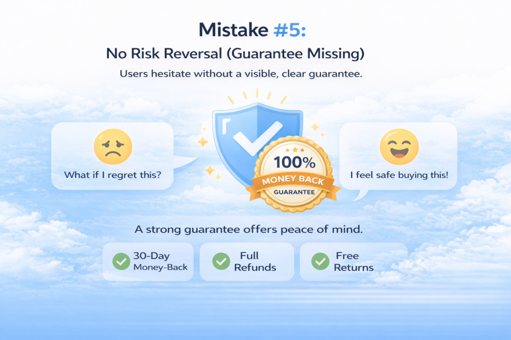
Even if users trust the product, they still hesitate because of one core fear: loss.
In ecommerce, people are far more sensitive to losing money than gaining value. This means even a small doubt can stop a purchase.
This is where risk reversal becomes critical.
Many Shopify stores completely ignore this by:
- Not offering a refund policy clearly
- Hiding guarantee information deep in the footer
- Or not offering any guarantee at all
When users cannot clearly see how they are protected, they assume the worst-case scenario:
“What if I buy this and regret it?”
A strong guarantee removes this fear instantly. It signals that the store is confident in its product and willing to take responsibility if something goes wrong.
Common examples include:
- 30-day money-back guarantee
- No-questions-asked refunds
- Free returns or exchanges
But the key is not just having a guarantee—it must be visible. Ideally, it should be placed near the add-to-cart button or pricing section so users see it at the exact moment of decision.
Without risk reversal, even interested buyers hesitate. And hesitation is where conversions die.
Mistake #6: Missing Brand Credibility Signals
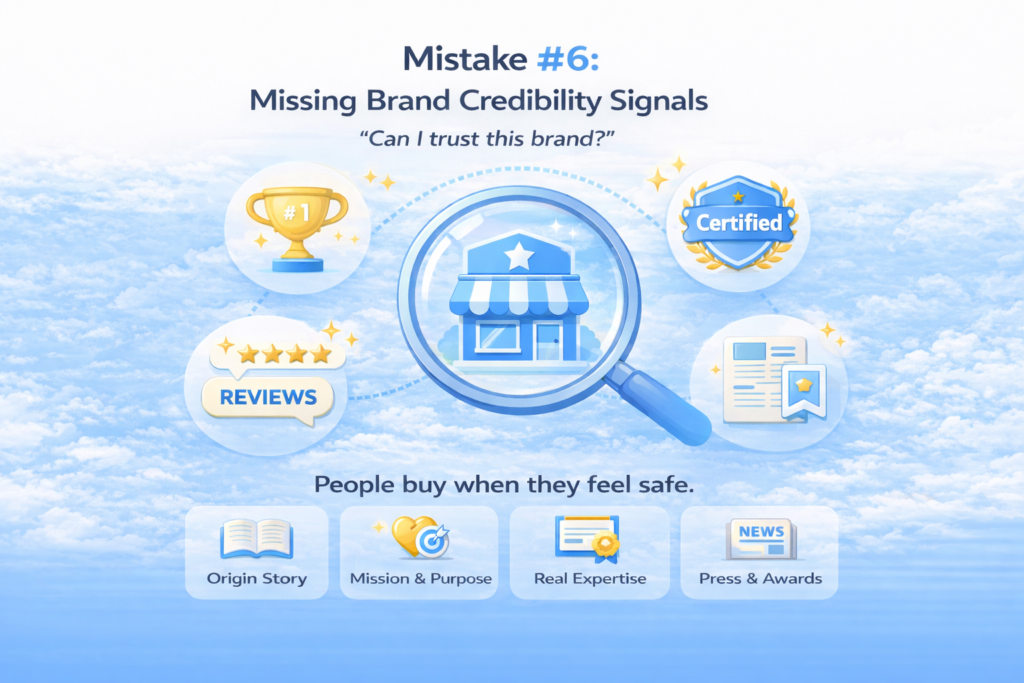
The third trust failure happens at a deeper level: brand credibility. Even if a product has reviews and guarantees, users still ask a final question:
“Can I trust this brand?”
Most Shopify stores fail here because they don’t provide enough context about who they are, why they exist, or why they are qualified to sell the product.
Common missing elements include:
- No “About the brand” or “Why choose us” section
- No story behind the business
- No explanation of product expertise or sourcing
- No visible authority or differentiation
Without these signals, the store feels anonymous. And anonymous brands struggle to convert cold traffic.
Strong brands reduce this uncertainty by showing:
- A clear origin story (why the brand exists)
- A mission or purpose behind the product
- Proof of expertise or specialization
- Real-world credibility indicators (press mentions, certifications, partnerships)
These elements don’t just provide information—they build identity. And identity builds trust.
When users feel like they understand the brand behind the product, they are far more likely to purchase. Without it, even good products feel risky.
Key Insight
People don’t buy when they’re convinced—they buy when they feel safe.
Mistake #7–9: Visual & UX Failures
Once clarity and trust are established, the next critical layer is how the product is visually presented and experienced. This is where many Shopify stores quietly lose conversions without realizing it. Even with a good product and strong messaging, poor visuals and weak user experience can completely break buying intent.
In ecommerce, users don’t read first—they scan, feel, and react. That reaction is heavily influenced by design, layout, and visual presentation.
Mistake #7: Poor Product Images (Biggest Silent Killer)
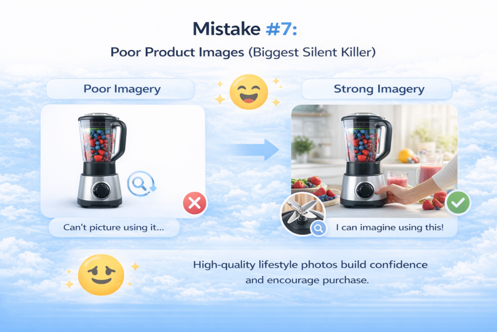
Product images are not just visual assets—they are the closest thing to physical experience in online shopping. When users cannot physically touch a product, they rely entirely on visuals to build confidence.
Yet one of the most common Shopify mistakes is relying on low-quality or incomplete imagery.
Many stores make the mistake of:
- Using only studio or plain-background images
- Not showing the product in real-life usage
- Ignoring emotional or lifestyle context
- Not offering zoom or detail views
This creates a gap between expectation and reality.
Users don’t just want to see a product—they want to imagine using it. Lifestyle images help bridge that gap by showing context, scale, and emotional relevance. A product alone on a white background feels abstract. The same product in real-world usage feels tangible and desirable.
Detail shots also matter. Users want to inspect texture, material, build quality, and design precision. If they cannot zoom in or see close-up details, doubt starts to build.
The absence of strong visuals forces users to guess—and guessing kills conversions.
Mistake #8: Confusing Layout / Information Overload
Even if the visuals are strong, poor layout structure can completely break the user experience. Many Shopify product pages try to include too much information at once, without prioritizing what matters most.
The result is cognitive overload.
Users are forced to:
- Search for key details
- Scroll through scattered sections
- Decode unstructured information
Instead of guiding the user, the page overwhelms them.
A high-converting product page is not about adding more information—it’s about organizing information in a way that matches how users think.
Most users follow a predictable scan pattern:
- What is this?
- Is it for me?
- Can I trust it?
- How do I buy it?
When important information is buried under long paragraphs, random sections, or inconsistent formatting, users lose focus. They stop scanning and start bouncing.
Good UX is about hierarchy:
- The most important information must appear first
- Supporting details must come after
- Secondary information should never interrupt decision flow
If users cannot quickly scan and understand the page, they will not stay long enough to convert.
Mistake #9: Weak Mobile Experience
Mobile is no longer optional—it is the primary traffic source for most Shopify stores. Yet many product pages are still designed with desktop thinking, resulting in a broken mobile experience.
This is one of the most damaging conversion issues because it affects the majority of users.
Common mobile UX problems include:
- Buttons too small or poorly placed
- Images not optimized for vertical viewing
- Text that requires excessive scrolling
- Layouts that break or feel cramped
- Slow loading times due to heavy assets
On mobile, user patience is extremely low. If the experience feels slow, cluttered, or hard to navigate, trust drops immediately.
Even worse, poor mobile design creates subconscious doubt. Users may not explicitly say it, but a messy mobile interface signals:
“This store is not professional.”
And when professionalism is questioned, purchase intent disappears.
A strong mobile product page should feel simple, fast, and effortless. Every element should be easy to read, easy to tap, and structured for quick decision-making.
Key Insight
Design is not decoration—it is persuasion structure.
Mistake #10–11: Conversion Friction Killers
Once clarity, trust, and UX are in place, the final layer that decides whether users actually buy is friction. This is where many Shopify stores lose “ready-to-buy” customers at the very last moment. The frustrating part is that these users are not uninterested—they are almost converted. But small technical and design issues silently push them away.
Mistake #10: Weak CTA Design

The call-to-action (CTA) is the final decision point on a product page. It is where intent turns into action. Yet many Shopify stores treat it as an afterthought, which directly hurts conversions.
One of the most common issues is invisible or poorly designed CTA buttons. If the “Add to Cart” button does not stand out visually, users may not even notice it during scanning. On a busy product page, attention is limited—so hierarchy matters.
Another major issue is the lack of urgency. Many stores simply display a static “Add to Cart” button without any psychological trigger. There is no reason to act now instead of later. This creates procrastination, and in ecommerce, delay usually means loss of sale.
Weak CTA design also includes:
- No visual hierarchy between primary and secondary actions
- Buttons placed too far down the page
- No reinforcement near pricing or product summary
- No emotional or contextual reinforcement (like “Buy Now & Get Free Shipping”)
A strong CTA should do three things:
- Stand out immediately on the page
- Create a clear action path
- Reinforce urgency or value at the moment of decision
If users have to search for the button, the conversion is already at risk.
Mistake #11: Slow Page Speed / Heavy Store
Even if everything on the page is perfect—clear messaging, strong visuals, and a great offer—it can all collapse if the page is slow. Speed is not just a technical metric; it is a direct conversion factor.
Most users do not wait for slow pages to load. If a product page takes too long, users leave before they even see the product. This means all your effort in design, copy, and structure becomes irrelevant.
On Shopify, one of the biggest hidden problems is app overload. Many store owners install multiple apps for reviews, popups, upsells, tracking, and customization. While each app may seem useful individually, together they significantly slow down the site.
Other common speed issues include:
- Uncompressed or oversized images
- Heavy scripts running in the background
- Poor theme optimization
- Too many third-party integrations
Slow speed creates more than just frustration—it creates doubt. Users subconsciously associate slow performance with unprofessional or unreliable stores. Even if they stay, their trust level decreases.
A fast product page, on the other hand, feels smooth, responsive, and trustworthy. It keeps users engaged and maintains buying momentum.
Key Insight
Even perfect pages fail if friction exists at the final step.
The Fix: High-Converting Product Page Framework
Now that you understand what kills conversions, the next step is to understand what actually works. High-performing Shopify stores don’t succeed by accident—they follow a clear, structured product page system designed around how users think, not how stores want to present information.
This is not optional. It is the structure of every high-converting Shopify product page.
1. Clear Headline (Value Proposition First)
The first element users should see is a clear, benefit-driven headline. This is not just the product name—it is the product’s promise.
A strong headline instantly answers:
- What is this product?
- Who is it for?
- What outcome does it deliver?
If users cannot understand this within seconds, they leave. The headline sets the tone for everything else on the page, making clarity the foundation of conversion.
2. Hero Image (Emotion + Context)
Next is the hero image, which is often more powerful than text. This is where users form their first emotional impression.
A high-converting hero image is not just a product shot—it shows:
- Real-world usage
- Emotional context
- Scale and practicality
Instead of showing a product isolated on a white background, show it in a situation where the user can imagine themselves using it. This creates desire, not just understanding.
3. Price + CTA (Visible Immediately)
The price and call-to-action should never be hidden or delayed. They must be visible without requiring users to scroll.
At this stage, users are already asking:
“Should I buy this?”
Your job is to make that decision easy. A clear price combined with a strong “Add to Cart” button reduces hesitation and keeps momentum high. If users have to search for the CTA, you lose conversions instantly.
4. Benefits Section (Not Features)
This is where most stores go wrong. Instead of listing technical features, high-converting pages focus on benefits.
Users don’t buy specifications—they buy outcomes.
Instead of:
- “Bluetooth 5.3 connectivity”
Say:
- “Stay connected without interruptions or lag”
This section should translate every feature into real-world value. The goal is emotional clarity, not technical overload.
5. Social Proof Section
Once users understand the product and its value, they need reassurance. This is where social proof comes in.
This section includes:
- Customer reviews
- Ratings
- User-generated content
- Testimonials with context
The purpose is simple: reduce doubt. When users see that others have already bought and benefited, their confidence increases significantly.
6. Trust Guarantees
Even with social proof, users still need to feel protected. This is where risk reversal becomes essential.
This section should clearly communicate:
- Refund policy
- Return policy
- Satisfaction guarantees
The key is visibility. Trust signals should not be hidden in footers—they should be placed near the decision point. This reduces fear and increases willingness to buy.
7. FAQ Section
Finally, the FAQ section handles remaining objections. At this stage, users are interested but still have small doubts.
FAQs should address:
- Shipping and delivery
- Product usage
- Returns and refunds
- Common objections
A strong FAQ removes hesitation before it becomes abandonment.
Final Insight
This is not just a design layout—it is a psychological flow. Each section moves the user from confusion → clarity → trust → action.
Quick Optimization Checklist (Action Section)
Before you start redesigning your entire Shopify product page, use this checklist to quickly identify the biggest conversion leaks. These are the core fundamentals that separate low-converting pages from high-performing ones. If even one of these is failing, you are likely losing sales without realizing it.
- Start by testing clarity. Can a new visitor understand what your product is, who it is for, and why it matters within 5 seconds? If not, your headline or positioning is too weak and needs immediate improvement.
- Next, evaluate trust. Do you have at least 10–20 real, authentic reviews visible on the page? Social proof is not optional in ecommerce—it is one of the strongest conversion drivers. Without it, users hesitate and abandon.
- Then check your call-to-action. Is your “Add to Cart” button clearly visible without scrolling? If users have to search for it, you are already losing potential buyers. The CTA should be obvious, strong, and impossible to miss.
- Now look at your visuals. Do your images show real usage, not just isolated product shots? If users cannot imagine the product in their life, they will not buy it. Lifestyle context is essential.
- Finally, test mobile experience. Does the page load quickly, feel clean, and function smoothly on a phone? Since most traffic comes from mobile, any friction here directly impacts revenue.
If any of these areas fail, your product page is leaking conversions—and fixing them will have an immediate impact on sales.
Conclusion
Most Shopify store owners assume low sales come from traffic problems, bad ads, or poor pricing. But in reality, product pages don’t fail randomly—they fail structurally. Every conversion issue can be traced back to one or more breakdowns in how the page communicates, builds trust, or guides the user to take action.
If you look closely, everything in this article comes down to three core pillars: clarity, trust, and friction. When clarity is missing, users don’t understand the product. When trust is missing, users don’t feel safe buying. When friction exists, users abandon even when they are ready to purchase.
Fixing conversions is not about guesswork or adding more apps—it’s about fixing these structural problems in the right order.
Now is the time to audit your own product pages honestly. Go through each section and identify where you are losing users. Even small improvements in these three areas can lead to significant increases in conversions and revenue.
Fix the page, and you don’t need to chase customers—they come ready to buy.
FAQ: Shopify Product Page Optimization
1. What makes a Shopify product page high converting?
A high-converting Shopify product page is built around three things: clarity, trust, and low friction. It clearly explains what the product is and who it is for, builds confidence through reviews and guarantees, and makes the buying process simple with a strong CTA and smooth user experience. When these elements work together, users are far more likely to complete a purchase.
2. What is the most important element on a Shopify product page?
The most important element is the value proposition at the top of the page. If users don’t immediately understand what the product is and why it matters, they won’t scroll further. However, the CTA button and trust signals like reviews are also critical because they directly influence purchase decisions.
3. How many reviews should a product have to build trust?
There is no strict number, but generally 10–20 genuine reviews is a strong starting point for building trust. More important than quantity is authenticity. Detailed reviews that describe real experiences are far more powerful than short, generic ones.
4. Why are Shopify product pages not converting?
Most Shopify product pages fail due to unclear messaging, weak trust signals, poor visuals, and unnecessary friction in the buying process. Even if traffic is high, these issues prevent users from completing purchases. In most cases, the problem is not traffic—it is the product page structure itself.
5. How can I increase my Shopify conversion rate quickly?
Start by fixing the basics: improve your product title clarity, add real customer reviews, use lifestyle images, and make your CTA more visible. Then focus on mobile optimization and page speed. Even small improvements in these areas can lead to noticeable conversion gains.