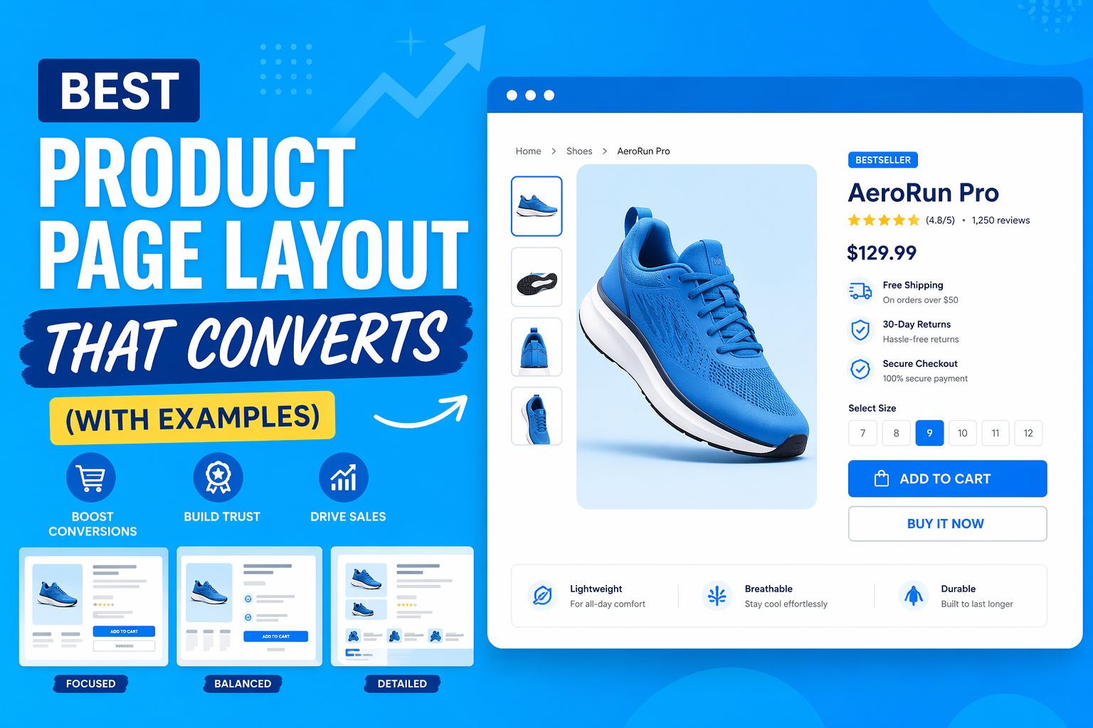
Most product pages don’t fail because they look bad—they fail because they don’t convert.
The data backs this up.
Across ecommerce, average conversion rates sit around 2–3%, meaning roughly 97 out of 100 visitors leave without buying. At the same time, research from Nielsen Norman Group shows users form an impression of a webpage in milliseconds, and behavior studies from Baymard Institute consistently highlight issues like poor information hierarchy, lack of trust signals, and unclear value propositions as major reasons users abandon product pages.
Yet most businesses focus on the wrong things.
They invest in visual design—colors, layouts, animations—assuming a better-looking page will convert better. But conversion isn’t driven by aesthetics alone. It’s driven by how clearly and quickly a page answers a buyer’s doubts.
Because when someone lands on your product page, they’re not thinking about your design. They’re thinking:
Is this worth it? Can I trust this? What if I regret it?
If your page doesn’t answer those questions in the right order, they leave.
In this guide, you’ll learn a proven product page layout framework grounded in user behavior and conversion data—along with real examples that show exactly why it works. This isn’t theory. It’s structure backed by how people actually decide to buy.
Table of Contents
Why Most Product Pages Fail
Most product pages don’t fail because of poor design—they fail because they don’t align with how people actually make buying decisions.
The data is clear.
Research from Baymard Institute shows that a significant percentage of users abandon purchases due to issues like lack of trust, unclear information, and complicated user experience. Similarly, studies from Nielsen Norman Group highlight that users don’t read pages fully—they scan, judge quickly, and leave if their questions aren’t answered immediately.
To understand why product pages fail, you need to understand the default mental state of a buyer.
The Buyer’s Mental State
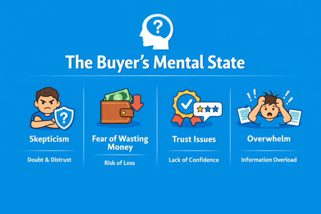
- Skepticism Users assume risk by default. They don’t trust your claims immediately, especially if they’ve never heard of your brand. This is why vague copy and generic promises don’t work.
- Fear of wasting money Every purchase carries perceived risk. According to behavioral research, people are more sensitive to potential loss than gain. If the downside isn’t addressed, they won’t move forward.
- Trust issues Lack of reviews, unclear policies, or weak branding creates hesitation. Even small trust gaps can stop a purchase. Trust is not built once—it’s reinforced throughout the page.
- Overwhelm Too much information, too many options, or a cluttered layout increases cognitive load. When users feel overwhelmed, they delay or abandon decisions.
The 5 Questions Every Product Page Must Answer
Every high-converting product page—regardless of industry—systematically answers these five questions:
- 1. What is this? Users need immediate clarity. If they can’t understand the product within seconds, they leave. This is why the above-the-fold section is critical.
- 2. Is it for me? Visitors quickly evaluate relevance. They’re looking for signals that the product fits their needs or identity. Generic messaging reduces conversions.
- 3. Can I trust this? Trust signals like reviews, ratings, guarantees, and brand credibility directly impact decision-making. Without trust, nothing else matters.
- 4. Is it worth it? Users compare perceived value vs price. This includes benefits, outcomes, and differentiation. Features alone don’t justify price—outcomes do.
- 5. What if I’m wrong? This is the final barrier. Return policies, guarantees, and risk reversals reduce hesitation. Removing risk often increases conversions more than adding benefits.
The Core Insight
A product page is not just a design—it’s a decision-making system.
If your page fails to answer these questions clearly and in the right order, users won’t buy—not because your product is bad, but because their doubts were never resolved.
The High-Converting Product Page Framework
A high-converting product page isn’t about design trends—it’s about structure. Each section plays a specific role in guiding the user from curiosity to confidence to action. When done right, this flow removes friction, builds trust, and makes buying feel like the natural next step.
1. Above the Fold (First Impression Layer)
The above-the-fold section is where conversions are won or lost.
Users don’t scroll first—they scan and judge. Research from Nielsen Norman Group shows that users decide whether to stay or leave within seconds. If your product isn’t clear, relevant, and trustworthy immediately, nothing below the fold matters.
This section must answer the first three questions instantly:
What is this?
Is it for me?
Can I trust this?
Here’s what actually needs to be there—and why it matters:
1. Product Image (Clarity + Desire)
- High-quality, clear, and preferably contextual (lifestyle or usage)
- Multiple angles or zoom if possible
Why it matters:
Users rely more on visuals than text for first impressions. The image is what creates initial desire and communicates what the product is without effort.
2. Product Name (Clarity Over Creativity)
- Simple, descriptive, benefit-oriented if possible
Why it matters:
Confusing or overly creative names reduce clarity. Users shouldn’t have to “figure out” what you’re selling.
3. Price (Transparency)
- Clearly visible, no hidden costs
- Optional: anchor pricing (discounts, comparisons)
Why it matters:
Price uncertainty creates friction. Users evaluate value instantly—hiding or delaying price reduces trust.
4. Primary CTA (Action Trigger)
- Clear button: “Add to Cart” / “Buy Now”
- Visually prominent
Why it matters:
Even if users don’t click immediately, they need to know what action to take next. Weak or hidden CTAs reduce conversions.
5. Key Benefits (Not Features)
- 3–5 bullet points
- Focus on outcomes, not technical specs
Why it matters:
Users don’t buy features—they buy results. Benefits help them quickly understand why this product matters to them.
6. Trust Signals (Risk Reduction)
- Star ratings
- Number of reviews
- Badges (secure checkout, guarantees, etc.)
Why it matters:
Trust must be established early. According to Baymard Institute, lack of trust is a major reason users abandon pages.
Mini Checklist: Above the Fold Optimization
Before moving on, validate this:
- Clear product image that shows use or context
- Instantly understandable product name
- Visible and transparent pricing
- Strong, obvious CTA button
- 3–5 benefit-driven bullet points
- Immediate trust signals (reviews, badges)
If your above-the-fold section fails, users won’t scroll.
And if they don’t scroll, nothing else you build matters.
2. Social Proof Section
At this point, the user understands your product. Now they’re asking a different question:
“Do other people actually trust this?”
This is where social proof comes in.
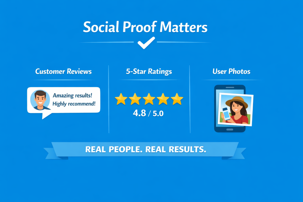
- Reviews Real customer feedback gives your product credibility. Detailed reviews—especially ones that mention specific results—are far more persuasive than generic praise.
- Ratings Star ratings act as a quick trust shortcut. Users don’t always read everything, but they notice ratings instantly.
- User-Generated Content (UGC) Photos or videos from real customers using the product. This is powerful because it feels unfiltered and authentic—something your brand can’t fake.
Why this matters:
People trust other people more than they trust brands. It’s that simple.
But here’s the part most miss:
Placement matters more than quantity
You don’t need hundreds of reviews buried at the bottom of the page. A few strong reviews placed early (near the top) can increase trust immediately and keep users from bouncing.
Social proof isn’t just validation—it’s momentum.
3. Product Story / Visual Explanation
Once trust is established, users start doing something more important—they try to imagine the product in their own life. This is where product storytelling through visuals becomes critical.
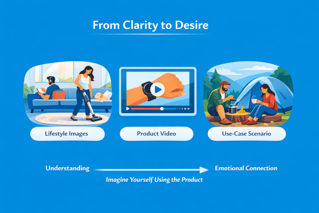
- Lifestyle visuals Show the product in real environments, not isolated studio shots. People don’t buy objects—they buy outcomes in context. Lifestyle images help bridge that gap.
- Videos Video increases understanding faster than text or static images. It reduces uncertainty by showing exactly how the product works in real situations.
- Use-case scenarios Instead of just showing the product, show situations where it solves a problem. This helps users mentally simulate ownership.
Why this matters:
Behavioral research from Baymard Institute consistently shows that unclear product understanding is one of the top reasons users abandon product pages. Visual context reduces this friction by making the product instantly understandable without effort.
There’s also a deeper layer here: visuals don’t just inform—they create emotional connection. When users can see themselves using the product, the decision shifts from logical evaluation to mental ownership.
At this stage, clarity turns into desire.
4. Benefits Over Features
Most product pages fail here because they talk in features instead of meaning.
But users don’t buy features. They buy what those features do for them.
There’s a simple hierarchy that high-converting pages follow:
- Feature → What it is
- Benefit → Why it matters
- Outcome → What changes in the user’s life
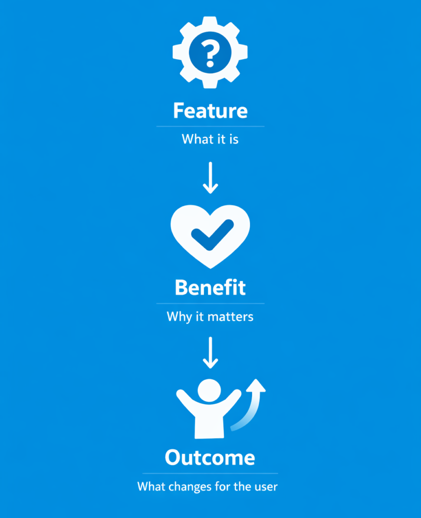
If you stop at features, you’re forcing users to do the translation work themselves. Most won’t.
Example 1
- Feature: Waterproof material
- Benefit: Keeps the product safe in rain or wet conditions
- Outcome: You don’t worry about damage when using it daily
Example 2
- Feature: 12-hour battery life
- Benefit: Lasts the entire day without recharging
- Outcome: You can travel, work, or commute without carrying a charger
Example 3
- Feature: High-resolution display
- Benefit: Clearer visuals and sharper details
- Outcome: A smoother, more enjoyable viewing experience with less eye strain
Why this works:
Research from Nielsen Norman Group shows that users don’t read deeply—they scan for relevance. Abstract features don’t trigger emotional or practical relevance on their own. Outcomes do.
That’s why benefit-driven copy consistently outperforms feature-heavy descriptions in conversion-focused design studies.
At the end of the day, users are not asking “What does this product have?”
They’re asking “How does this improve my life?”
5. Objection Handling Section
By this stage, the user is interested—but not fully convinced. This is where most sales are lost, not because people don’t want the product, but because unanswered doubts create hesitation.
Every product page has friction points. If you don’t address them, users mentally exit the page even if they don’t physically leave it immediately.
This section is about removing that friction before it becomes a decision barrier.
FAQs (Clarity Layer)
Frequently asked questions are not just informational—they’re reassurance tools. They answer the small doubts that don’t fit neatly into your main description, like compatibility, usage, or product details.
Shipping (Expectation Control)
Clear shipping information removes uncertainty. When users don’t know when or how they’ll receive a product, hesitation increases.
Returns (Risk Reduction)
A simple return policy lowers perceived risk. People are far more likely to buy when they know they can undo the decision easily.
Guarantees (Confidence Boost)
Money-back guarantees or satisfaction promises act as final reassurance. They signal that the brand is confident in its product.
Why this matters:
Research from Baymard Institute consistently shows that unclear delivery information, return policies, and hidden costs are among the top causes of cart abandonment. These are not minor issues—they directly block conversions.
At this stage, the goal is simple: eliminate doubt.
Because when uncertainty disappears, buying becomes the easiest option left.
6. Trust Reinforcement
Even after objections are handled, users still look for one final confirmation: “Is this brand actually legitimate?”
This is where trust reinforcement comes in. It’s not about convincing users with claims—it’s about proving credibility through external validation.
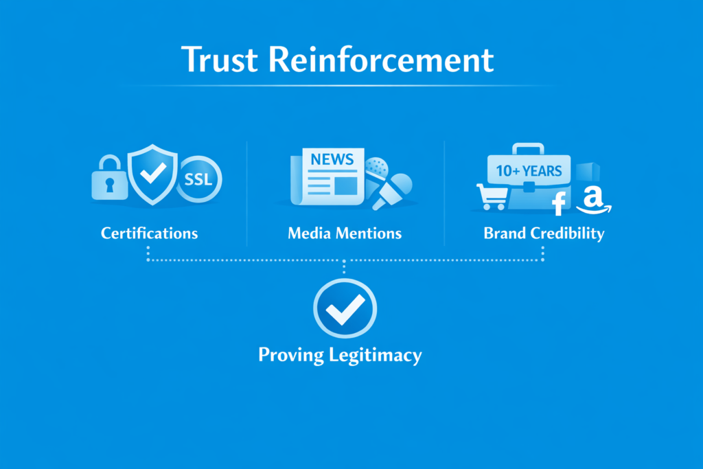
Certifications
Certifications, security badges, or compliance indicators reduce perceived risk. They signal that the product or business meets recognized standards, especially in categories where safety or payment security matters.
Media Mentions
Being featured in reputable publications or platforms acts as third-party validation. Users interpret this as: “If others are talking about it, it must be legitimate.”
Brand Credibility
This includes anything that strengthens perceived authority—years in business, number of customers served, partnerships, or recognizable logos of companies you’ve worked with.
Why this matters:
Users rarely trust a brand based on its own claims alone. According to research from Nielsen Norman Group, credibility cues are processed quickly and often subconsciously, influencing whether users feel safe continuing toward purchase.
At this point, trust is no longer being built—it’s being confirmed.
7. Urgency & Scarcity
At this stage, the user is convinced—but not necessarily motivated to act right now. That’s where urgency and scarcity come in.
They don’t create desire. They accelerate decision-making.
Limited Stock
Showing low inventory or limited availability taps into loss aversion. When people believe something might run out, they tend to act faster to avoid missing out.
Offers / Time-Limited Discounts
Discounts or special offers with a clear time boundary create a reason to act immediately instead of “thinking about it later.” Without a deadline, most users delay—and never return.
Why this matters:
Behavioral economics research consistently shows that humans are more sensitive to potential loss than gain. This is known as loss aversion, a core principle in decision-making psychology. Urgency works because it reframes delay as a possible loss.
Important warning:
Overusing urgency or fake scarcity destroys trust. If users notice patterns like constant “limited time” offers or fake stock warnings, it stops working completely—and can even reduce long-term conversions.
Used correctly, urgency is a final push. Used poorly, it becomes noise.
8. Final CTA Section
At this point, the user has seen everything they need to make a decision. If they’re still on the page, they’re not confused anymore—they’re just deciding whether to act now or later.
This is where the final call-to-action matters.
Repeat CTA
The same primary action—“Add to Cart” or “Buy Now”—should appear again, clearly and confidently. The user shouldn’t have to scroll back up to find it.
Reinforce Value
Right before the CTA, briefly restate the core benefit or outcome of the product. Not features—outcome. This reminds the user why they were interested in the first place.
Why this matters:
Most users don’t convert on the first moment of clarity. They convert when clarity is repeated at the moment of action. This is why high-performing product pages don’t rely on a single CTA—they reinforce the decision at multiple points in the journey.
At this stage, the goal is simple: remove final hesitation and make the next step effortless.
Real Product Page Examples
This is where theory becomes real.
Understanding the framework is useful—but seeing how top brands execute it is what actually sharpens your judgment. The goal here isn’t to describe what these pages look like. It’s to understand why they convert at a high level and what psychological mechanisms they are using.
Across all strong product pages, one pattern becomes obvious: they don’t try to “convince” users in one place. Instead, they reduce doubt step by step across the entire page.
Let’s break down a few real examples.
Example 1: Apple
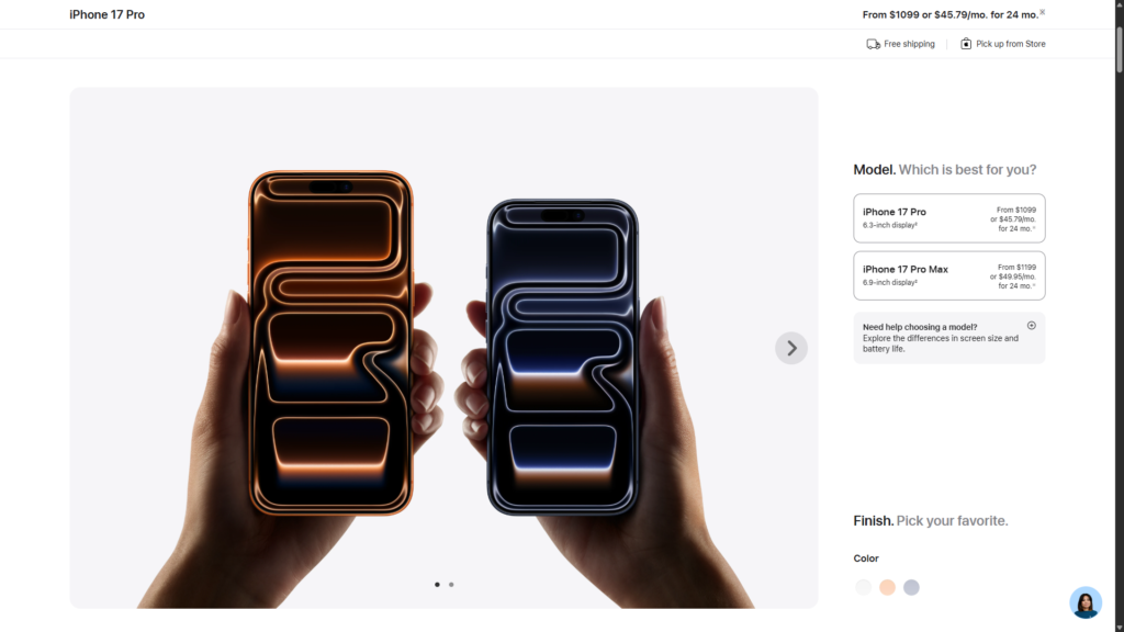
What they do:
Apple product pages are extremely minimal, but highly structured. They focus on clarity, visuals, and controlled information flow.
Key strengths:
- Clean above-the-fold layout with immediate product clarity
- Heavy use of high-quality visuals and video demonstrations
- Minimal distractions—everything supports the main product decision
- Strong emphasis on outcomes (experience, not specs)
- Trust is assumed through brand authority and consistency
Psychological triggers used:
- Simplicity reduces cognitive load
- Visual dominance creates instant understanding
- Brand trust eliminates early-stage skepticism
This works because Apple removes decision friction. Users are not overwhelmed—they are guided.
This reduces doubt by making the product instantly understandable without requiring explanation.
Example 2: Gymshark
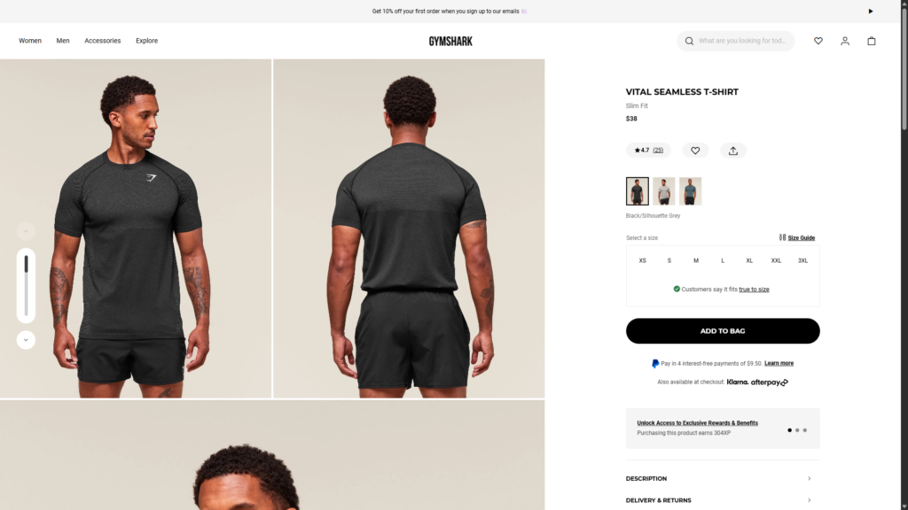
What they do:
Gymshark focuses heavily on lifestyle positioning and identity-driven marketing.
Key strengths:
- Strong lifestyle imagery showing real people using products
- Heavy integration of social proof and influencer content
- Clear CTA placement repeated throughout the page
- Size, fit, and product clarity sections reduce hesitation
- Community-driven branding reinforces trust
Psychological triggers used:
- Social identity (“people like me use this”)
- Belonging and aspiration
- Peer validation through influencers and UGC
This works because Gymshark sells identity, not just apparel.
This reduces doubt by showing users what they will look like and become after buying.
Example 3: Allbirds
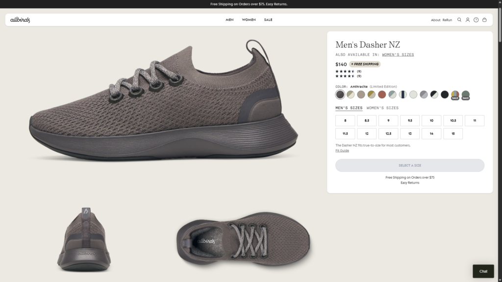
What they do:
Allbirds builds trust through simplicity, transparency, and sustainability messaging.
Key strengths:
- Clear product storytelling focused on comfort and materials
- Transparent breakdown of materials and sustainability impact
- Strong focus on product benefits over technical jargon
- Simple layout that avoids overwhelming users
- Trust reinforced through ethical positioning
Psychological triggers used:
- Transparency reduces skepticism
- Simplicity increases comprehension
- Ethical positioning builds emotional trust
This works because Allbirds removes complexity from both product and messaging.
This reduces doubt by making the decision feel responsible and easy.
Example 4: Glossier
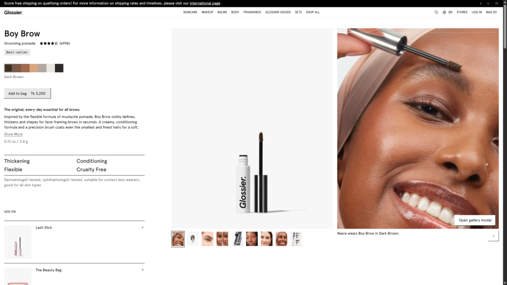
What they do:
Glossier uses community-driven validation and minimalistic design.
Key strengths:
- Heavy reliance on real user photos and testimonials
- Clean, soft visual design that feels approachable
- Product descriptions written in simple, relatable language
- Strong emphasis on “real people” usage context
- Reviews are central, not secondary
Psychological triggers used:
- Social proof as primary conversion driver
- Relatability over authority
- Reduced intimidation for first-time buyers
This works because Glossier makes beauty feel accessible, not complex.
This reduces doubt by removing the “am I doing this right?” anxiety.
Key Takeaway Across All Examples
Despite different industries, all high-performing product pages follow the same principle:
They don’t sell harder—they reduce uncertainty better.
Each brand uses different tactics, but the underlying system is identical:
- Clarify instantly
- Build trust early
- Show proof continuously
- Reinforce value repeatedly
- Remove risk before asking for action
That is what separates average product pages from high-converting ones.
Common Mistakes That Kill Conversions
Most product pages don’t fail because they’re missing “best practices.” They fail because they actively create friction that pushes users away.
Here are the most common mistakes that quietly destroy conversions—even on otherwise well-designed pages.
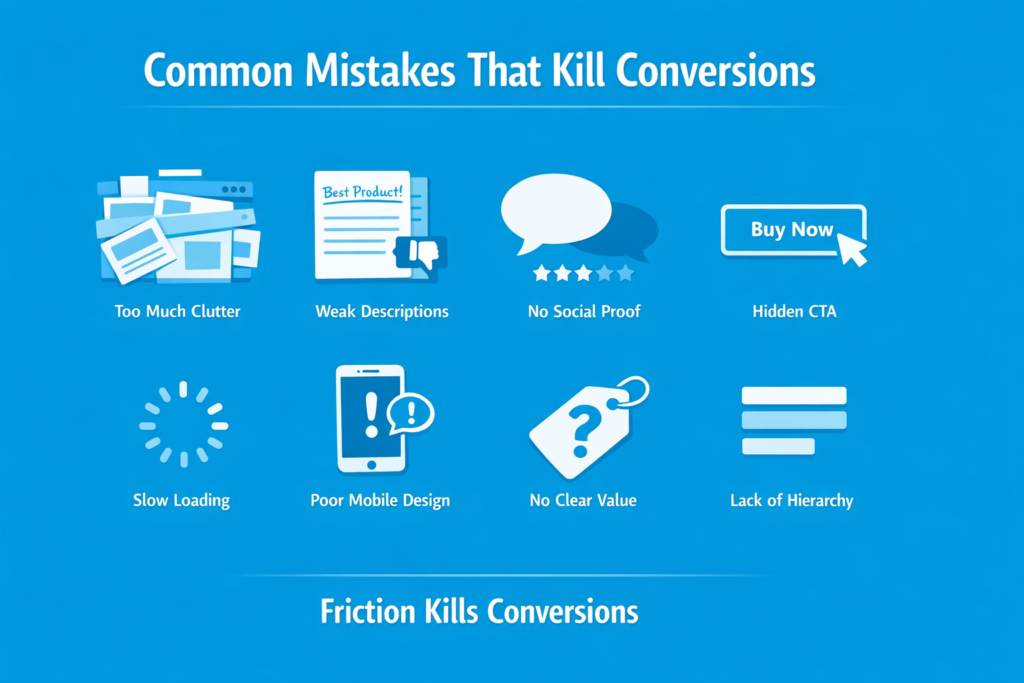
1. Too Much Clutter
When everything is trying to stand out, nothing stands out.
Overloaded layouts, excessive banners, and unnecessary sections increase cognitive load. Users don’t know where to look, so they do the easiest thing: leave.
Consequence: confusion replaces clarity, and confusion kills decisions.
2. Weak Product Descriptions
Generic copy like “high quality product” or “best in class” adds zero value.
Users don’t trust empty claims—they look for specifics, outcomes, and proof.
Consequence: the product feels interchangeable, so price becomes the only deciding factor.
3. No Social Proof
A product without reviews feels untested, even if it’s good.
People rely heavily on other buyers to validate decisions. Without that signal, uncertainty increases sharply.
Consequence: users hesitate and delay the purchase indefinitely.
4. Hidden or Weak CTA
If users have to search for the “Buy Now” or “Add to Cart” button, you’ve already lost momentum.
CTAs are not decoration—they are decision points.
Consequence: intent drops because action feels unclear or inconvenient.
5. Slow Loading Speed
Even a one-second delay can significantly impact conversions. Users don’t wait—they switch.
According to studies from Nielsen Norman Group, slow experiences directly increase abandonment rates because users interpret delay as poor quality.
Consequence: trust drops before the page is even seen.
6. Poor Mobile Design
Most traffic today comes from mobile. Yet many product pages are still designed primarily for desktop.
Small buttons, broken layouts, or hard-to-read text create friction instantly.
Consequence: high bounce rates from mobile users, even if the product is strong.
7. No Clear Value Communication
Listing features without explaining why they matter forces users to do mental work.
Most won’t.
Consequence: the product feels confusing or overpriced.
8. Lack of Visual Hierarchy
When everything is visually equal, nothing feels important.
Users scan, not read. If hierarchy is missing, key messages get ignored.
Consequence: important information gets lost, and decisions are never formed.
Final Reality Check
Every mistake above does one thing: it increases doubt or effort.
And in ecommerce, even small amounts of friction lead to lost revenue.
A high-converting product page isn’t about adding more elements—it’s about removing everything that slows down the decision.
Advanced Conversion Insights
This is where most articles stop—but this is where real understanding begins.
High-converting product pages are not just a collection of sections. They are decision systems built around how users think, scan, and eliminate risk in seconds.
Below are the deeper principles that separate average pages from high-performing ones.
The First 5-Second Rule
Users don’t “read” product pages—they decide whether to stay within the first few seconds.
In that time, they’re answering:
- What is this?
- Do I trust it?
- Is it relevant to me?
If these aren’t clear instantly, everything else becomes irrelevant.
This is why clarity above the fold is not optional—it’s structural.
Visual vs Copy Roles
Visuals are not decoration. They do the initial selling.
- Visuals create emotion and desire
- Copy creates justification and logic
If visuals are weak, copy has to work too hard—and most users won’t read that far.
Strong pages let images do the emotional work, while copy simply confirms what users already feel.
Information Hierarchy Controls Behavior
Users don’t read in order—they scan.
They follow:
- size
- contrast
- positioning
This means hierarchy decides what users think is important, not intention.
If your CTA, price, and benefits are not visually prioritized correctly, users may never see them—even if they exist.
Simplicity > Creativity
Creative product pages often fail because they prioritize uniqueness over clarity.
But clarity is what drives conversion.
Users don’t reward clever design. They reward fast understanding.
Every unnecessary visual or copy element adds cognitive load—and reduces decision speed.
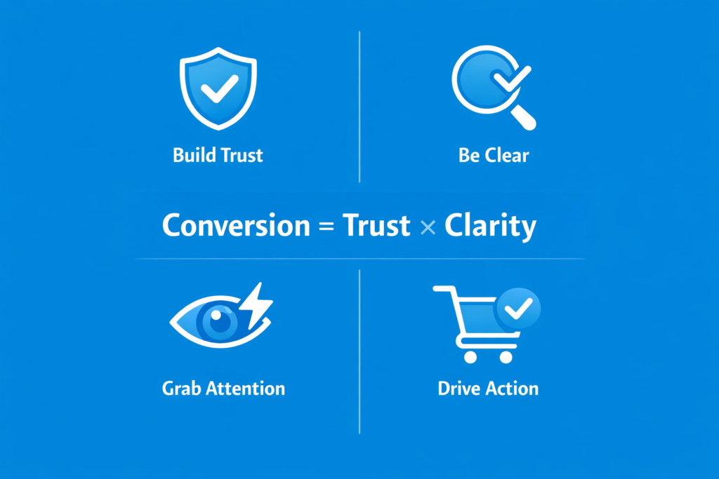
Conversion = Trust × Clarity
This is the simplest model that explains everything:
- If trust is low → no conversion
- If clarity is low → no conversion
- If both are high → conversion becomes natural
This is why adding more features rarely fixes performance issues.
You don’t need more persuasion. You need less confusion.
Final Insight
The best product pages don’t “sell harder.”
They remove resistance faster than competitors.
And in ecommerce, speed of understanding is often more powerful than depth of explanation.
Conclusion
Product pages don’t convert randomly—they convert because of structure.
Every high-performing page you’ve seen, whether it’s a global brand or a small ecommerce store, follows the same underlying principle: reduce doubt step by step until the decision becomes obvious. It’s not about adding more elements or copying trends. It’s about controlling the order in which a user understands, trusts, and evaluates a product.
When you break it down, conversion is not a mystery. It’s a system built on clarity, trust, and well-sequenced information.
If your product page is not performing, the issue is rarely the product itself. It’s usually how the information is structured and how quickly it helps users answer their own questions.
Now the next step is simple: don’t just read this framework—apply it.
Audit your product page using this structure. Identify where users are losing clarity or trust, and fix those gaps one by one. Even small improvements in flow and hierarchy can lead to measurable increases in conversion.
FAQ Section
This section helps answer common search queries directly and improves your chances of ranking for featured snippets and long-tail keywords.
What makes a product page high converting?
A high-converting product page is built on clarity, trust, and structured information flow. It clearly explains what the product is, who it is for, and why it is worth buying—within seconds. It also uses strong visuals, social proof, benefit-driven copy, and clear calls-to-action to guide the user toward a decision. Most importantly, it removes friction by addressing doubts like pricing, shipping, returns, and trust concerns throughout the page, not just at the end.
How long should a product page be?
There is no fixed length, but effective product pages are long enough to answer all buyer questions without forcing the user to leave for external information. Simple products may require shorter pages, while high-consideration or higher-priced products usually need more detailed explanations, visuals, FAQs, and trust signals. The key is not length—it’s completeness. A page should only be as long as necessary to remove doubt and support the buying decision.
What is the most important element of a product page?
There is no single “most important” element, but the above-the-fold section is the most critical starting point. It determines whether a user continues or leaves. This includes the product image, clear product name, price, primary CTA, key benefits, and initial trust signals. If this section fails to create clarity and interest immediately, the rest of the page often never gets seen. However, conversion is ultimately the result of all sections working together in sequence.